A Responsive Design Workflow
Category: Web Design - Published: Jan 23, 2012 - Tags: responsive design
Designing responsive website can take a little while to get used to because some of the layout techniques and the ways we’ve created mockups over the years are no longer practical. If you are accustomed to using Photoshop or Fireworks to build layouts you may quickly realize that responsive designs can take three or more times the work to create mockups in this fashion. Especially, for those designers who don’t code, responsive design will be difficult to adjust to.
But with any new technique a process will develop. So here are some tips for creating a better workflow and some other useful information about responsive design I’ve found around the web.
UPDATE: Since writing this, I’ve changed a lot of how I approach doing responsive design which I’ve covered in my Revised Responsive Design Workflow post. There is still some good information here but also make sure to check that out.
The most important thing to remember is responsive design is a process. You won’t be building a pixel perfect layout and then developing it exactly as is. Get it roughly how you want it in Photoshop then move into the browser or simply start out in the browser. Make a change, test, repeat.
If you are completely in the dark about responsive design, here is a list of resources to get started with: Responsive Design Roundup and I have more strune throught the post.
Define Your Break Points
Before doing anything, figure out where your breakpoints are going to be. The most common breakpoints are:
- 320 pixels - smartphone portrait
- 480 pixels - smartphone landscape
- 600 pixels - small tablets(think Kindle Fire) in portrait
- 768 pixels - small tablet in landscape
- 1024 pixels - some tablets, notebooks, desktop monitors
- 1200 pixels - widescreen display monitors
- 1600 pixels - rich people with their ginormous monitors.
Obviously you won’t be designing for all of them. A typical responsive design tends to have 3-4 break points that cover a small range of viewport dimensions. As a general example, you may choose one break point for smartphones (less than 480 pixels), another for the smaller viewports (768 pixels or less for tablets), common desktop sizes 1024 pixels, and maybe above 1200 pixels for large monitors.
Getting Started
With your break points defined, now you can begin to consider the design layout. If you haven’t already, familiarize yourself with what other people are doing (what layouts work).
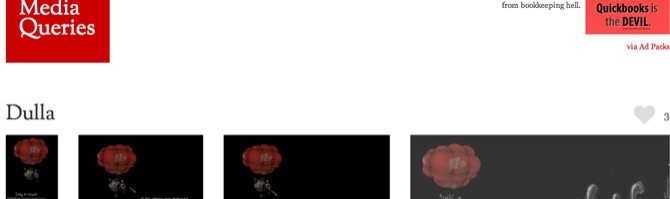
Check out Media Queries a css gallery specifically for responsive layouts that shows all four break points side-by-side.
There are a few schools of thought about which layout to start with. Personally I like taking a priority based approach. Make a list of all the content that will need to be displayed on the homepage. Next, order the list from most to least important. Then, take this same list and reorder the items from most to least important for each break point. Each layout has it’s own priorities and design considerations to take into consideration.
Less important items may have to be removed from smaller layouts and you may need to reorganize items based on what users are doing on the site at different browser dimensions. Google Analytics or similar software is your best friend for this. For example, if 90% of your smart phone users are looking for contact information or store locations, you will want to make your 480 pixel layout reflect that.
Using this technique will help when you have to make important decisions about what content to emphasize and what if any, content to remove.
As an example lets make a design portfolio website, something we are all somewhat familiar with.
Our responsive design layout will have these priorities at 1024 pixels:
- Title
- Tagline
- Contact Us Call-to-Action
- Work Samples
- Primary Navigation
- Condensed About blurb
- Contact information
- Testimonials
- New Client Survey Form
- Condensed Services list
- Social Media links
- Latest Blog Entry
- Copyright Information
At 480 pixels or less, the priority list may look like this:
- Title
- Tagline
- Contact Information
- Condensed About blurb
- Primary Navigation
- Work Samples (reduced to 1 sample)
- Condensed Services list
- Social Media links
- Copyright Information
Contact Us Call-to-ActionTestimonialsNew Client Survey FormLatest Blog Entry
You might not be used to designing website layouts based on priority but it is important because with so many differently layouts it becomes a challenge to find room for, and promote your most important content in each.
Once you have the list you can start knocking out sketches. Remember these don’t have to be perfect. I like sketching because it is super fast, easy to change and allows you to see a couple of differnt layouts laid out on a table next to each other for quick comparisons.
To get started I like to sketch all 3-4 viewports on the same piece of paper. Less looking back and forth and you don’t get too focused on one viewport. Start each sketch with the most important element, say your logo. Create a box for it in each viewport sketch. Then just keep moving down the list, adding navigation, primary and secondary content, footer and so on. Focusing on one viewport get you in trouble when you move to the other ones so I like to do all four at the same time, element by element.
For personal projects I don’t wireframe but if you are working with others and your stetchs aren’t ledgible enough, now would be the time to do that.
Getting to the Browser
As soon as you can, build a prototype off of your sketches/wireframes. You no longer have or want to wait until the design is completely finished to begin building the website. In fact a lot of people start here before opening Photoshop and add design elements later on. Personally I have to see at least one of the layouts in Photoshop first but if you don’t, just skip it. Testing and tweaking various elements are going to take up a large amount of time, so the sooner you can get going the better.
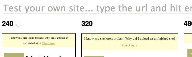
If you happen to be working on a live server use this to quickly check your viewports: http://mattkersley.com/responsive/, just type in your URL.
What About Client Work
If you are working for a client you will have to show them something. I recommend showing them a desktop mockup and the smartphone mockup, the rest they can use their imagination on.
When Working on Mockups In Photoshop
Don’t really worry about kerning, tracking, leading or font sizes too much. We all know text in Photoshop is imposible to get right, so don’t bother unless a client needs to see it. For more on fonts, keep reading below.
The Markup
With a responsive design I like to code my homepage completely first before touching the css. I do this so I have all the content there and don’t forget anything. When that is done I start on the universal styles like basic colors, background and anything that will remain consistent throughout. Basically, the stuff that is already defined in the HTML5 Boilerplate along with A tags, paragraph, blockquote, list styles, etc. Then I set up the different media queries and the coresponding layouts, without saving images or doing to much design styling. Just to be able to see if the layout is going to work or not. And once I’ve seen that it works, save background images, non-placeholder images, and do all the design styles.
Conversions
Depending on how you are setting up your layout you are probably going to be using ems or percents. So here are some conversion tools.
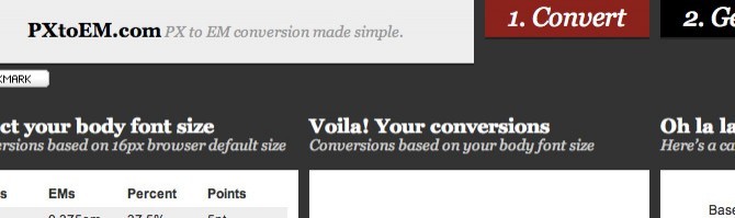
For type use http://pxtoem.com/
Creating Fluid Grids us http://csswizardry.com/fluid-grids/
Responsive Images
Images can be another pain in the ass. Here is some good reading to keep you busy:
- Fluid Images
- Adaptive Images at 24Ways.
- Adaptive Images Again and yet another from 24Ways
Frameworks
One way to save development time is to use a CSS framework. They do take a bit of time to get the hang of. But a site or two down the road you will be working a whole lot faster than if you are coding it all from scratch. There are tons out there. Here are a few:
- http://fluidbaselinegrid.com/
- http://designinfluences.com/fluid960gs/
- http://thatcoolguy.github.com/gridless-boilerplate/
- http://html5boilerplate.com/mobile
Other Stuff to Look At
And if you don’t have enought to read, here are some other good articles about responsive design from around the web.
- Responsive Web Design. One of the original articles about responsive design by Ethan Marcottes on A List Apart.
- Ethan Marcotte’s notes from his Event Apart Speech “The Responsive Designer’s Workflow”.
- http://trentwalton.com/2011/05/10/fit-to-scale/ Trent Walton’s take on doing responsive design. A short one.
- Responsive Web Design Toolbox - 50 Tools A whole bunch of stuff to get you working.
- In Search of a Responsive Workflow by A. Craig Williams. A good read.