Responsive Images in ExpressionEngine
Category: Web DesignCategory: ExpressionEngine - Published: Nov 29, 2011 - Tags: expressionengine responsive design
With CSS media queries it is simple to put together a responsive website design. One of the drawbacks of using a responsive design over a separate mobile site, is the large file sizes of image designed for a desktop browser.
Luckily, ExpressionEngine makes it easy to save multiple image versions, sized to fit any layout. Couple that with a little CSS and you have a website that looks good on a desktop browser or mobile devise, and has images sized accordingly.
The Responsive Design
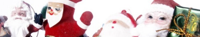
For an example I created a super-basic, responsive layout. But you can use this same idea to build a site designed for any number of dimensions. See the simple demo here. This example is just static html and is not plugged into ExpressionEngine but you can see the basic concept; 3 different images are displayed based on the width of the browser window.
The largest image, santa_large.jpg is an 800x150 pixel image that is displayed when the browser is 800 pixels or wider, which was resized to fit in this post.
The next sized image down is santa_medium.jpg, a 600x150 pixel image that is displayed when the browser is under 600 pixels wide.
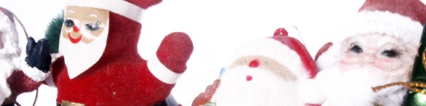
The smallest image santa_mobile.jpg, a 400x150 pixel image, is displayed when the browser is under 480 pixels wide.

Responsive Design Demo Markup
If you did not take a look at the demo here is the html and css to get to this point.
<html>
<head>
<title>Responsive Images with ExpressionEngine - Demo | Couchable.co</title>

<style>

/* BASIC STYLES */
body { margin: 0; padding: 0; }
h1 { text-align: center; }
#wrap { width: 800px; margin: 0 auto;  }
article { background: #ccc; width: 100%; padding: 10px; margin: 10px 0; clear: both; }
article div { width: 100%; background: url(santa-large.jpg) center center no-repeat; height: 150px; }
.stuff { float: left; padding: 10px; width: 28%; margin: 10px 5px; }
article div { margin: 10px 0; }
article p { padding: 10px; }

/* MEDIA QUERIES */

@media screen and (max-width: 799px) {

    #wrap { width: 100%; margin: 0; }
    article { padding: 0; margin: 0; }
    article div { margin: 0 auto; width: 95%; background: url(santa-medium.jpg) center center no-repeat; height: 150px; }
    .stuff { width: 100%; margin: 0px auto; padding: 10px 0; clear: both; }
}

@media screen and (max-width: 480px) {

    #wrap { width: 100%; margin: 0; }
    article { padding: 0; margin: 0; }
    article p { margin: 0; }
    article div { margin: 0 auto; width: 100%; background: url(santa-mobile.jpg) center center no-repeat; height: 150px; }
    .stuff { width: 100%; margin: 0px auto; clear: both; padding: 10px 0; }
}

</style>


</head>
<body>
<div id="wrap">
<h1><a href="http://couchable.com/blog/post/responsive-images-with-expressionengine">Responsive Images with ExpressionEngine</a></h1>
<article>
    <h1>Demo Article</h1>
    <div></div>
    <p>Lorem ipsum dol...<</p>
</article>

<div class="stuff">
    <p>Lorem ipsum dol...<</p>
</div>

<div class="stuff">
    <p>Lorem ipsum dol...</p>
</div>

<div class="stuff">
    <p>Lorem ipsum dol...</p>
</div>

</div><!-- #wrap -->
</body>
</html>
Bring In ExpressionEngine
So now it is time to take this little example and drop it into ExpressionEngine. You will need:
- A Channel - I named mine blog
- A File Channel Field - I named mine blog-image
- A File Upload Directory - I named mine blog-images
The CSS
To serve up a different version of the image for each Media Query I created a div inside the article, and set the background as the image we want to use.
article div { width: 100%; background: url(santa.jpg) center center no-repeat; height: 150px; }
In your ExpressionEngine template you would change it to the following:
{exp:channel:entries channel="blog" limit="1"}

article div { width: 100%; background: url({blog-image}{path}_large/{filename}.{extension}{/blog-image}) center center no-repeat; height: 150px; }

{/exp:channel:entries}
All we are doing is replacing the image name with the File Channel Field, which I had named blog-image. The _large is the Image Manipulation done in ExpressionEngine to create each sized image.
Here is the CSS showing just the images:
{exp:channel:entries channel="blog" limit="1"}

article div { width: 100%; background: url({blog-image}{path}_large/{filename}.{extension}{/blog-image}) center center no-repeat; height: 150px; }

@media screen and (max-width: 799px) {

    article div { margin: 0 auto; width: 95%; background: url({blog-image}{path}_medium/{filename}.{extension}{/blog-image}) center center no-repeat; height: 150px; }

}

@media screen and (max-width: 480px) {

    article div { margin: 0 auto; width: 100%; background: url({blog-image}{path}_mobile/{filename}.{extension}{/blog-image}) center center no-repeat; height: 150px; }

}
{/exp:channel:entries}
Image Manipulation in the File Upload Directory
Now that the template is set up we have to set the size of the images that need to be created.
There are two ways you can do this: 1) have ExpressionEngine automatically create the different images sizes or 2) have the user upload separate images for each version of the site. There are reasons to use both methods but to keep this simple, I am going to go with option 1 for this tutorial.
In the control panel create a new File Upload Directory. I used blog-images. When you get to the bottom where it says Image Manipulations, this is where you will create the various versions of your image. Here are the three for this example:
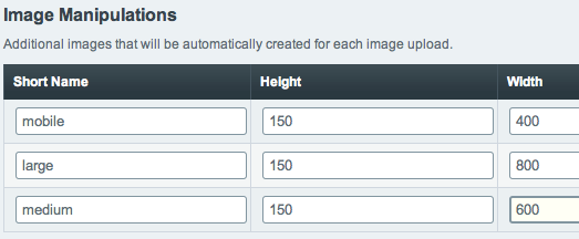
It is probably best to set resize to crop, but there may be reasons to use constrain as well.
Here is a little explanation if you need a little more help with working with images in ExpressionEngine.
Drawbacks
This method uses a div to represent an image, so you will have to do something to make it recognizable by screenreaders. You could add a short description inside the div and force it off the page with text-indent. Or if the image is just decoration you can leave it blank.
More
And if you want to learn more about responsive images, here is some good info on the subject.
A pretty simple concept really, but hopefully image file sizes won’t keep you from using responsive designs for your web projects. If you have any suggestions for improving this little demo or questions let me know.