Using Responsive CSS Frameworks for Faster Development
Category: Web Design - Published: May 22, 2012 - Tags: css responsive design
Responsive design is cool and all. The shift from desktop to multiple screen sizes, both small and large, will continue but the problem of the increased development time associated with creating responsive designs can hurt. Especially, when you end up with a totally custom design that needs to work in 3-4 viewports.
Luckily, there are plenty of css frameworks that are ready for responsive design.
Pros of Using a Responsive Framework
- Faster Development
- Cheap development
- They’re free
- Standards and conventions already set
- Bugs and browser problems largely solved
- Less testing required
The first time you use a framework inevitable you’ll end up having to spend time getting familiar with it, but each time after that it should become faster. If you aren’t building websites every day it might not be worth the time investment. You just have to figure out how much time you spend building sites compared to your other tasks.
Probably the biggest benefit of using frameworks and boilerplates is the fact that most of the testing has already been done. Most of the larger ones have fixes and workarounds for all of the little bugs in different browsers and mobile versions, so you don’t have to worry as much about it. Most of use aren’t doing extensive mobile testing unless it is a major project that has the budget for it. Using a framework saves you time and gives you a little more piece of mind that at least someone has done some testing.
Cons
Whenever you use a boilerplate, template or framework you are bound to run into some problems. What you gain in speed you sometimes lose in flexibility.
- Highly custom designs can be harder to create
- Learning curve
- Problems updating version to version
- Can be difficult to implement with some CMSes
- Additional/Uneccessary markup
- Higher load speeds and additional files
- Bringing in other developers can be more difficult if they don’t know the framework
Some Helpful Responsive CSS Frameworks
Here are some of the many responsive css frameworks you can take a look at. There are pros and cons of each, but I tried to only select the frameworks that are regularly updated and supported and have a decent following. So that you don’t get stuck with something that isn’t going to be around next year. Well some of these are pretty new, but there is enough variety here that everyone should be able to find something they can be happy with.
Gumby Framework
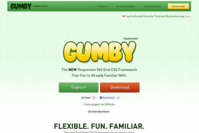
The Gumby 960 Grid is based on, you guessed it, the 960 Framework. With the addition of being responsive and having additional built in styles that go along with most frameworks. If you’ve used 960, which most people have, this is a nice place to start.
Gumby is very robust. It not only has the usual grid but also contains buttons, forums, dropdowns and tabs. They also happen to look not to bad, might be worth using right out of the box without any additional styling.
YAML
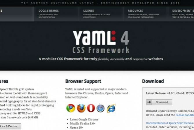
YAML is one of those frameworks that has been around forever. Now in version 4 which is responsive. I have one site I built with version 3 and a new one I’m working on with version 4. It does seem like there is a little bit of extra markup which I don’t care for, but knocking out layouts is really fast.
Skeleton
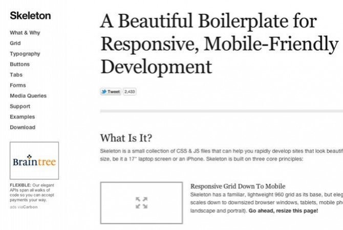
Skeleton is a pretty minimal framework. It has forms, buttons and tabs like some of the other ones with very few files to add to your site.
Frameless Grid
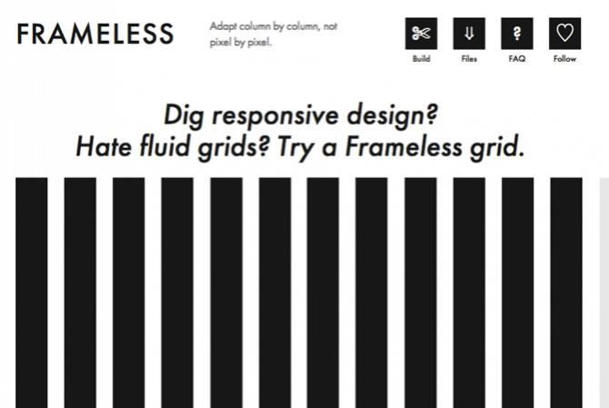
Not so much an entire framework but is a grid-less system for developing responsive sites. It also has a download for LESS and SASS which makes it worth mentioning here.
Bootstrap, From Twitter
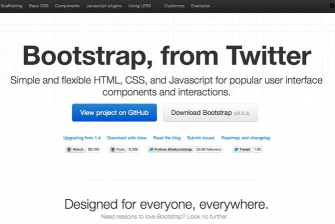
A hole bunch of markup goodness in the css, html and javascript variety created by the guys behind a service you might have heard up… Twitter. Based on the usual 12 column grid. Both fixed and fluid. Lots of support for mobile and can use with LESS.
Foundation Framework
MQ Framework
This one is a 12 column grid with a fixed and fluid grid to choose from.
Gridless Boilerplate
A simple gridless boilerplate.
Semantic
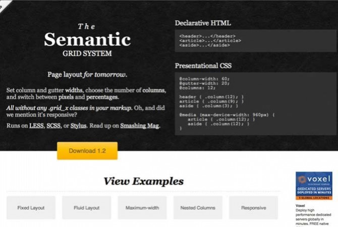
Really simple and responsive. Runs on LESS, SASS or Stylus. Looks pretty clean.
1140 CSS Grid
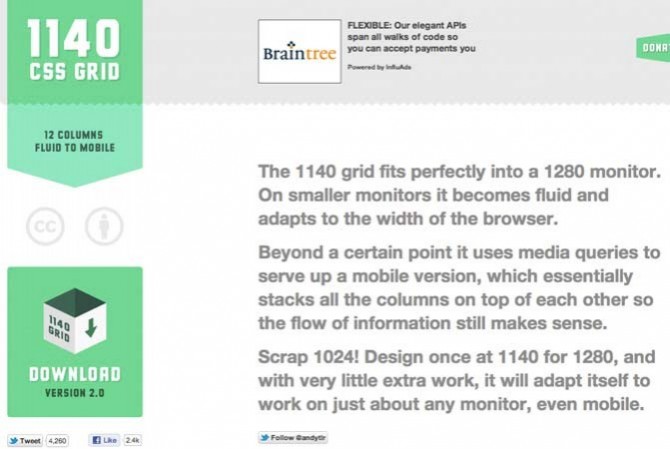
If you’re going responsive why start at 960 or 1040, might as well go big at 1140 and work your way down.
Even More
Yes there are a ton of these. Here are a few more if you still want to see what else is out there.
Other CSS Frameworks & CSS Related Tools
Here are some other useful tools you may want to take a look at.
Tiny Fluid Grid
A cool website with three scrollbars where you can change the number of columns, gutter, and min/max width.
Blueprint CSS
One of the frameworks that has been around for quite a while.
EZ-CSS
Ridiculously small at 1kb.
SASS
I’m sure by now everyone has heard of SASS. For large projects or people spending lots of time writing style sheets this or LESS should be on your list of timesavers.
Gravity Framework
An html and css framework built with SASS. Looks pretty cool, especially if you use SASS. Doesn’t look like a whole lot of documentation or examples of use however.
Compass
Another CSS framework built with SASS.
LESS
Very similar to SASS. Honestly I haven’t had time to compare the two. Maybe in a later post.
960 Grid System
An oldie. This was the first grid system I ever tried way back when.
Formee
Helps you develop and style forms faster.
HTML5 Mobile Boilerplate
The mobile html5 boilerplate. Enough said.
Choosing A Framework
This is a pretty big list and everyone will have to weight in different factors when making a choice. Here are a few things I look at:
- Learning Curve - You should be able to be up and running in a few hours
- Features - It should help you develop responsive sites faster, that is the goal
- Documentation - It needs good documentation. Hopefully a few sample layouts that you can pick apart or modify.
- Community - Larger projects are better, especially if there is a community behind it of people working on the project or that are there who can answer questions
If there are any good frameworks I missed or other CSS tools you like using let me know in the comments below.