10 Thinks I’d Like to See Stay in 2011
Category: Web Design - Published: Dec 29, 2011 - Tags: news
For all the great thing that happened in the web design world this year, there are some that I would rather see stay in 2011. Some were new, while others were remnants of the past that just don't have any purpose anymore.
Earlier this month I posted 10 Ways the Web Has Improved in 2011. Here are my 10 that I would rather not see again.
QR Codes
You still see them everywhere but the idea has failed. Yes, tons of people have smart phones these days. But most of them don’t have QR code readers. The ones who do, like myself, still never use QR codes. Half the time they don’t work, or take several attempts to scan. When they do work, the page they take you too, is a complete waste of time. To get people to use QR codes, there needs to be something actually useful, something you cannot get another way, and there never is. In the time it takes to open the app, and can the code I type in a website URL if its short.

QR codes could be useful but every one I’ve ever tried has been nothing but a marketing gimmick, poorly executed. People know this, so they don’t bother to scan anymore, if they ever did.
Daily Deal Sites
This fad was huge in 2011 but never really panned out, for me at least. I don’t use them because I tend to buy things that I need, not what is on sale.

Facebook Commenting System
This one blows my mind. Why would you alienate non-Facebook users (there are billions out there)? Why would you trust Facebook with your comments? Especially, when there are perfectly viable alternatives. I personally have stopped reading several blogs that have switched to the Facebook commenting system and I know I am not the only person. If you know something reason why using Facebook Comments is a better option of the alternatives out there please leave a comment. I’d like to hear it.
Big Companies Swallowing Startups
Facebook and Google are the two most obvious ones, but the trend of huge companies swallowing up every startup they can get their hands on is really hurting innovation. I’m sure it is great for the startup founders, getting the big paycheck, but it hurt everyone else in the longrun.
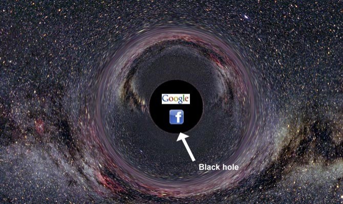
The really scare thing is, companies like Google and Facebook are so big now that they don’t even need to buy startups anymore. They can simply unleash their army of coders, recreate the exact same product under their own name, with just a few new twists thrown in.
Interface Ribbons
I think I asked for this last years, but 2012 might be the year to put them to rest for a bit. Making ribbons in your web designs is super easy, hence why they have been so overly used. They are also so easy to recognize which is why I think so many web designers are tired of seeing them.
Overdone Parallax Scrolling
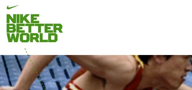
Most of use where pretty impressed with parallax scrolling websites the first couple times we saw them. But now that it isn’t new anymore, it just doesn’t seem very effective either. The content looks ok when you scroll quickly through it but it doesn’t look that great when you stop and try to read. A lot of times the current background is halfway off the viewable area.
OK, we’ve seen this gimmick, lets move along
I am going to ignore the fact that the pages tend to take a very long time to load because of the number of large PNGs. I like the effect, it does have it’s uses. But I don’t see long, one-page, parallax websites being a good design solution going into the future.
Location Based Apps
Fun for a little while, until we realized how pointless they are. Making scavenger hunts could be fun but it isn’t something I’ve ever actually done. Other than that, Checking-In for a small discount at restaurants isn’t enough to make me want to us any of these apps any longer.

Social Media Overload
2011 was the year that everyone and their mom trotted out a new social app. The funny thing was, many of use actually tried a lot of them. All of these newcomers along with Twitter, RSS, Facebook, G+, Path and so on, made for a whole bunch of noise that didn’t provide a whole lot of benefit. I am becoming increasingly reluctant to try anything new because I just don’t have the time and really just don’t care that much anymore. Facebook works. Twitter works. RSS works. Why bother with something new when it is only slightly different. RSS has been and will continue to be my favorite way to find out what is going on on the web and it has been around for years.
I’ve come to realize that I don’t really use social media to be social. Facebook was the only place I was connected to real life friends and family and I closed my account this year. So now, I only use social media for my career and actually prefer it that way.
Flash
Oh, poor Flash. I actually don’t dislike you all that much, but your time has come and gone. It has been a fun run and you served the web community well. Even when you require updating and crash browsers fairly frequently. You still hold a place in my heart, way back in the corner somewhere.
Overpriced Adobe Creative Suite Licences
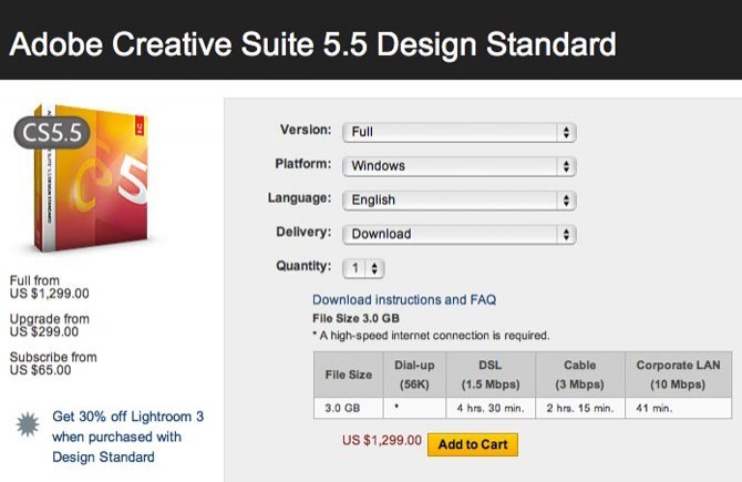
Currently web designers have to shell out a ton of money to keep up-to-date with Adobe’s latest versions. Which they pump out about every 1.5-2 years. It sucks because 75% of what comes with the Suite we don’t need or use. I use InDesign rarely but need to have it. I only use Illustrator for creating logos, which I rarely do anymore. I use Photoshop to create my website mockups but the programs was never really intended for this use. It works but it is far from perfect and 90% of the features of Photoshop don’t apply to interface design. Making for a huge bloated piece of software we only use 25% of. Fireworks should be what web designers use but it isn’t really any better than Photoshop and doesn’t get enough developer love to warrant making the switch. Dreamweaver is a bloated pile of garbage. But I sometimes have to us it for clients who want to edit their own content but don’t want or can’t afford a CMS.
One of these days I am going to write a post about what the perfect web development tool would be. Been thinking about that a lot.
Only a handful of these have the potential to come true. But I guess that is what wishes are for. Happy New Year everyone!
