College Website Design Inspiration
- Published: Oct 03, 2011 - Tags: interface design
Inspiration can be found anywhere. College websites are no exception. I work for a college as a web designer so I tend to look at these a lot anyway but everyone can learn something. College and University websites are very complex, with thousands of pages that can go many levels deep. By studying how colleges handly the tough task of building navigation and creating a site structure that is easy to navigate, you can apply it to your own websites.
Displaying Content on College Websites
Another thing to study about college websites is how, what and why they present content on the homepage. Colleges have many different departments, organizations and internal groups, all with different objectives and needs. The sites must appeal to perspective student while be useful for current students, staff and faculty. There are so many people to please, so much content that could make it on the homepage, and so many target audiences to appeal to, that it simply cannot be done perfectly. There is also the issue of fundraising and bringing in revenue. Especially with the cuts being felt in schools in the US, the rising costs of an education, and a high unemployment rates, enrollment is down in most colleges. So the marketing message that is conveyed is that much more important.
I have looked at hundreds of college and university website and here are some of the ones that I found particularly well done with regards to design and layout. There is definitely some consistent elements throughout. Most schools choose to have a series of primary news or promotional elements above the fold. The rest of the content is broken down into smaller columns and sometimes a sidebar, going down in priority as the content is further down the page. The same as most news sites. Without a doubt, red is the most popular color for colleges and universities followed by blue and there were very few dark colored designs to be found. Other colors are far less prevalent but I tried to give a good cross-section of colors in this roundup. For the most part colleges are tied to a preexisting set of colors so they cannot deviate too much on the website.
Biola - My favorite college website, great colors. Clean design and consistent design throughout.
Washtenaw - Always nice to see original illustrations in web design, especially on a college website were things are typically pretty clean lacking artistic elements.
Capitol - Really like the header on this one.
Acadia - Nice use of school colors.
Sierra Nevada - A great use of a large background image on this one.
Seattle
Earlham
American
American
Chico
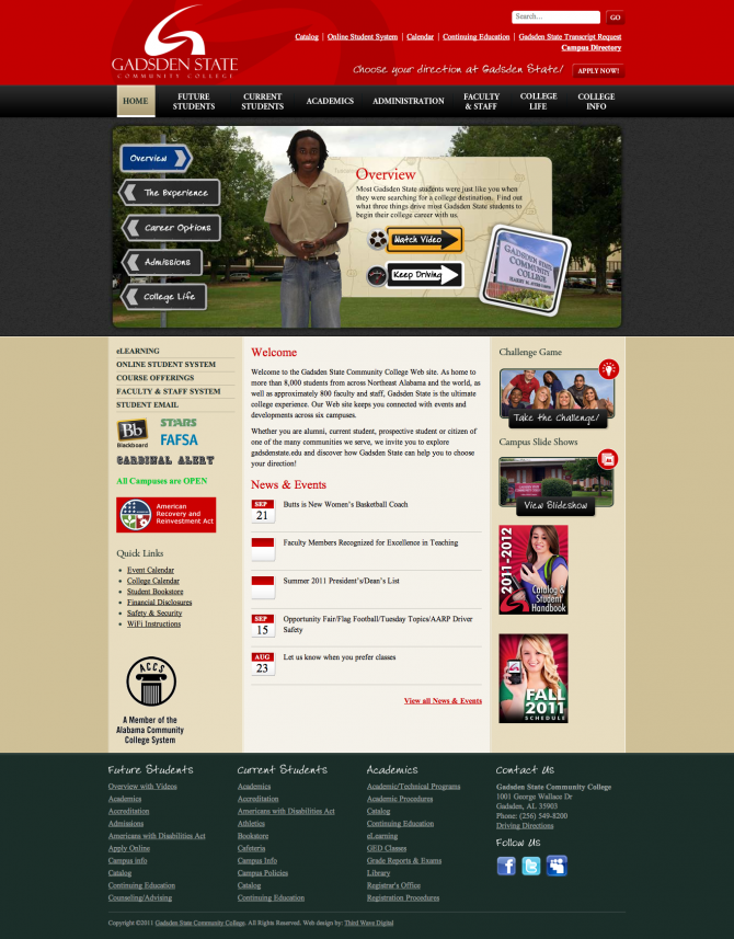
Gadsden
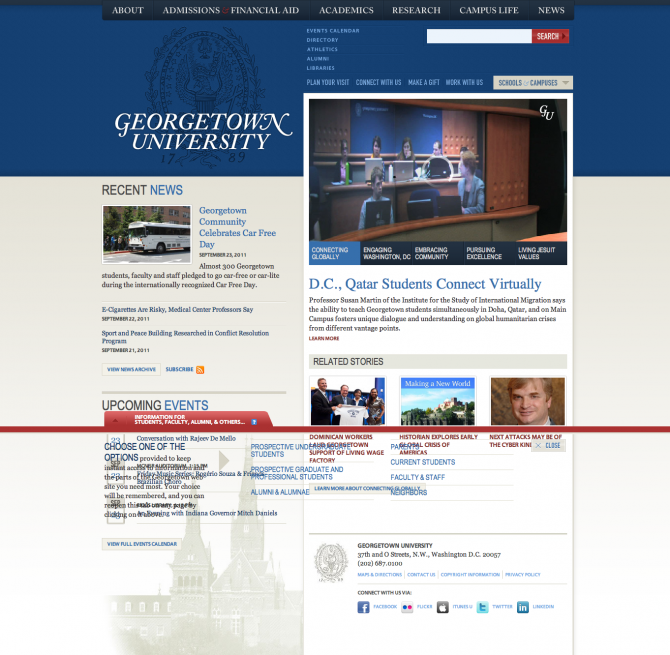
Georgetown

Liberty
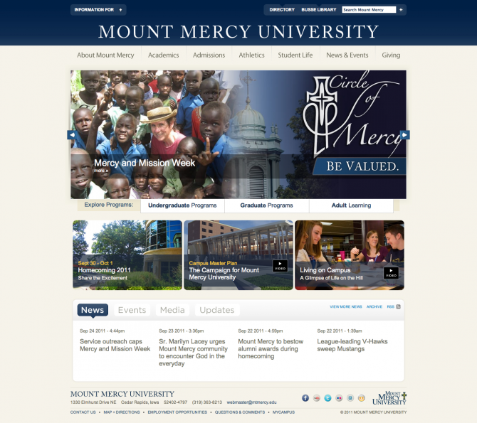
Mount Mercy
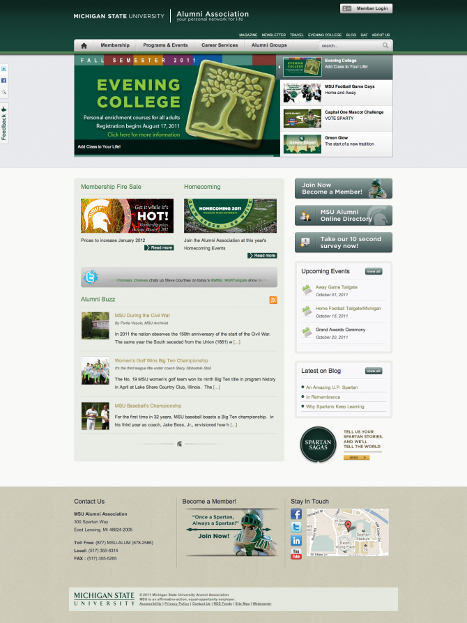
Michigan State
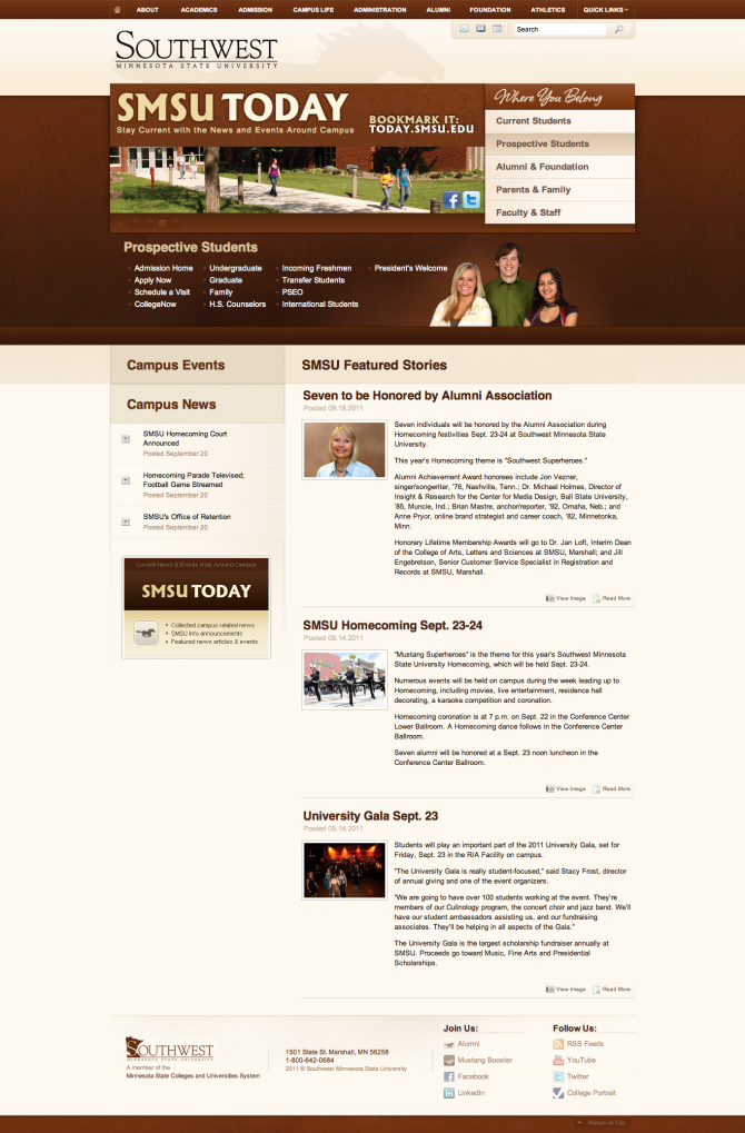
SMSU
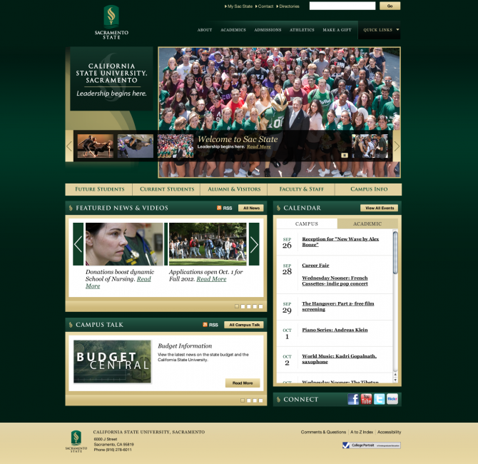
Sacramento
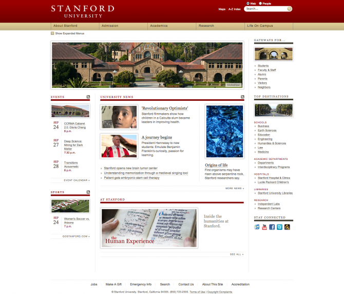
Stanford
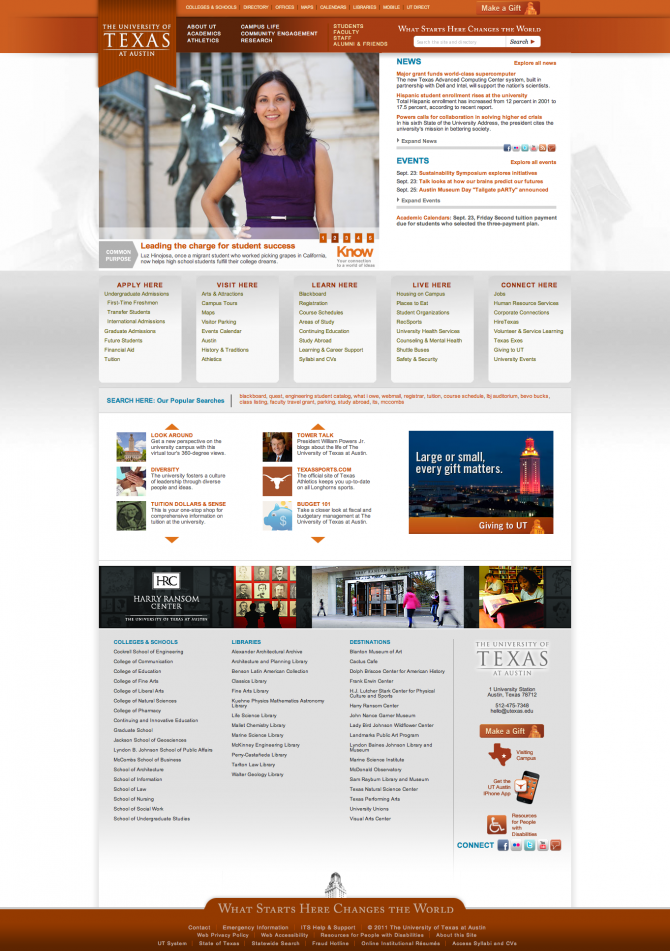
Texas A little text link heavy but a nice design.

Trinity
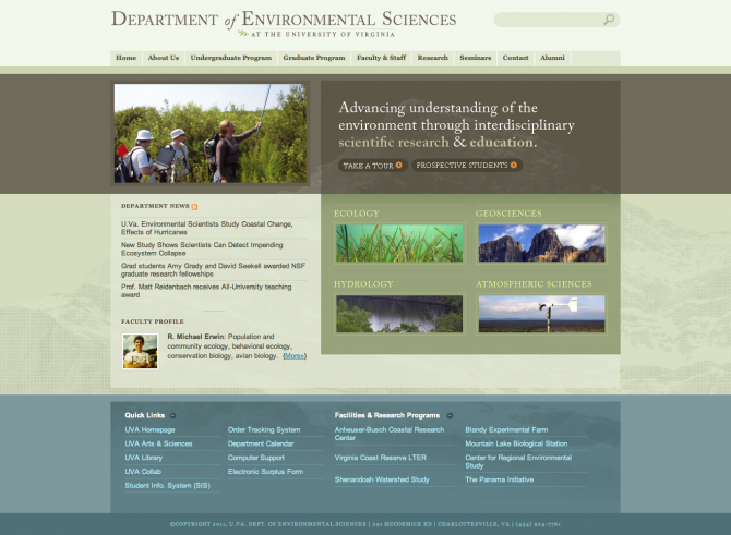
Virginia


Texas A little text link heavy but a nice design.


Do you have a favorite college or university website design that has inspired you? Did I leave a good one off the list? Let me know and I’ll try to add it.
