Responsive Design Tools For Speedy Development
Category: Web Design - Published: Jun 22, 2012 - Tags: responsive design css
Responsive design is becoming if not isn't already a design standard. The focus of this post is tools, tutorials and templates to help you build designs faster. Reusing code, templates, tools, using frameworks, javascript and more, plus lots of other resources from around the web.
Responsive design is great and pretty straightforward once you get the hang of it. But the biggest drawback is the extra amount of testing and development time required to build out a site. There isn’t always a lot of major css changes needed going from say 1200 pixels wide to 960 pixels. But when you get down to 360 pixels inevitable your layout starts to fall apart and more development time is required.
So here are some tips, tricks and tools to hopefully speed up your development type. My goal, and I’m sure most of you are thinking the same thing, or should be, is to build almost every website from this point forward with at least a separate layout for mobile if not more.
CSS Frameworks
There is a little bit of a time investment to learn a framework but the ability to reuse code and come up with layouts that use simple content areas that adjust easily can really save you some time once you develop a responsive design workflow. I’ve found the trick, just like with email templates is to use common layouts and just spend the design time making those elements look good. Less time reinventing the wheel and more time designing what content you have.
The other week I put together a list of the better responsive css frameworks to try. If you haven’t tried one, or are thinking about getting into SASS or LESS now would be the perfect time.
Here is a nice article that can introduce you to using SASS for responsive design.
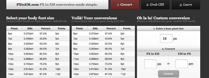
Pixels vs. Percents vs. EMs
This has been up for debate long before responsive design even came around. For fonts pixels was the standard but IE didn’t allow pixel based fonts to scale when enlarged in their browsers. Zoom still worked but if you want to be accessible Ems was a better although still clunky method. Jonathan Snook wrote a nice article highlighting the benefits of using REM for font sizes, which is new to CSS3. REM (root Em) is set to the root html element and not the parent. So there aren’t as many confusing issues with sizes compounding as elements are placed in side each other.
The same concerns happen with responsive design and different PPIs of the various resolutions of different devices.
Ultimately, for speeding up your development it comes down to finding a standard and sticking to it. Ems and the new REM is looking like the most accessible method so you may want to stick to that.
Here is an interesting article about the Goldilocks Approach for using Ems with your layouts.
When dealing with large heading text across multiple views, Fit Text can be a nice solution worth looking at.
Menus
Creating your navigation is almost always the most time consuming part of doing responsive design. Here are some of the different methods available outlined by Brad Frost: Responsive Navigation Patterns. The best thing to do for seep is to find the methods other people are using successfully and do the same: Some of those methods are outlined in the links below:
Design Shack has a tutorial on Coding a Responsive Menu which adjusts pretty well.
Chris Coyer has a cool little method (and fast) of switching from a normal menu down to a select drop down for mobile phones, which happen to play pretty nicely with select menus. You can see it here: Convert a Menu to a Dropdown for Small Screens.
Here is one last tutorial that uses a combination of a couple different looks and works both with and without Javascript. The Filament Group came up with this well done tutorial: A Responsive Design Approach to Navigation.
Images
Large images can sometimes be tricky. Here is a nice php script that takes a lot of the fuss out of dealing with images: Adaptive Images. It resizes images based on the visitors screen size.
Another element people also want to add to their sites is a slideshow, yet scaling it can be difficult. Here is nice little (1kb) jQuery slideshow that is responsive.
Here are a few other slideshows in case that one isn’t going to work for you.
Using Meteor Slides for a responsive slideshow in WordPress.
Flexslider for you Drupal folks. Does more than just slideshows but it works for this purpose when you combine it with Views Slideshow.
Templates
Starting from scratch can be nice but takes a lot of extra time. There are a number of templates built for individual content management systems, blogging platforms and simple html templates that can get be a great starting point, especially if they are barebones without a lot of extra markup.
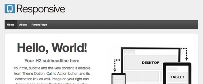
Responsive Wordpress Templates
If you are going to build a blog you might as well use WordPress. There are already a number of quality responsive WP templates available for free. I also included a few premium templates that were worth looking at.
Nine different layouts to use to quickly put a site together with various content and sidebar layouts. A good place to start for simple sites that need to be responsive.
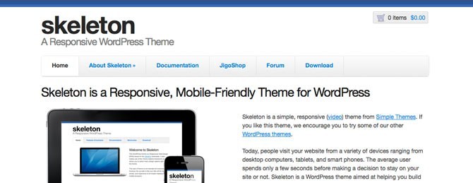
A simple responsive theme to start with. It is built with the 320 and Up Boilerplate Extension.
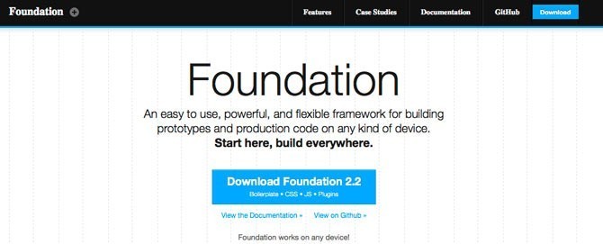
A responsive theme built with the Foundation Framework and the HTML5 Boilerplate built in.
Another responsive theme to take a look at. Fairly customizable and ready to use from the beginning.
Responsive Drupal Themes
Still not a fan of Drupal but I’ve been plugging away at it. Here are some of the better Drupal 7 themes I’ve found that are responive. Some are good starter themes to build from and some look decent enough to use the way they are with a few small changes.
Built on the 960 grid system. Probably the most popular responsive base theme, next to Zen maybe.
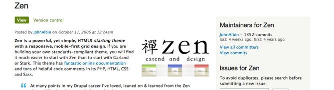
Pretty much the most popular Drupal starter theme. Lots of good developers behind it and constantly being updated.
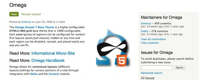
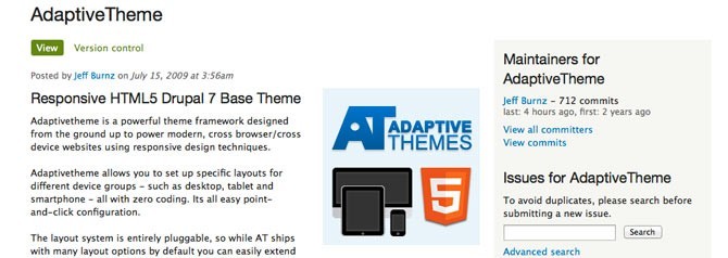
Yet another solid base theme to work with if your doing a lot of Drupal development.
Other Responsive Design Tools
Here are some other tools that can help you out that I haven’t mentioned yet or didn’t fit into a specific category.
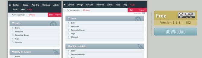
I haven’t included a lot of ExpressionEngine stuff because well, you don’t really need add-ons and themes for EE. But here is one little nugget to share: A Responsive Control Panel Theme.
Screenfly - Allows you to view your site at multiple viewports. A large list of mobile devices views to test.
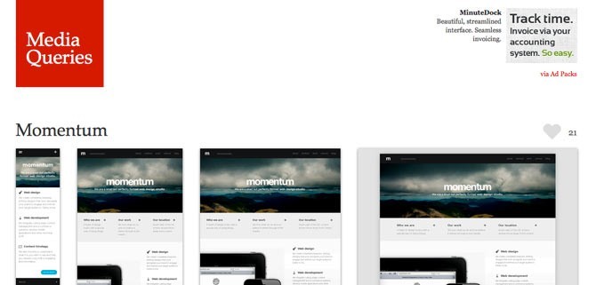
Not necessarilly a tool but a nice way to see some well done responsive designs with each layout side-by-side. This helps those visual folks out there wrap their head’s around the different techniques you can use.
Anything I missed? What tools do you use to speed up development?