Yellow Website Designs
- Published: Oct 23, 2011 - Tags: interface design
Here is a collection of yellow websites. Yellow is one of those colors that typically is only used for a accent color. Yellow can be a hard color to design with because it can be overwhelming on a bright backlit screen that you don't get in the print world.
The biggest use of yellow in websites is to use an off-white yellow color as a background. The other primary use of yellow in websites, aside from being an ascent color, is using it in combination with black to make a high contrast, high impact website. Typically with only those two colors for maximum effect. It was a little difficult to put this collection together, but here are the ten good examples I was able to find.
Always Sunny
An incredibly funny show and a pretty nice website design. Yellow on yellow with black as the accent and text colors.

Beer Camp
Both the 2010 and 2011 sites are pretty nice. 2010 is a better design but 2011 definitely takes a different approach.



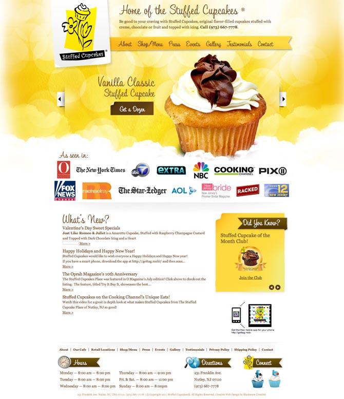
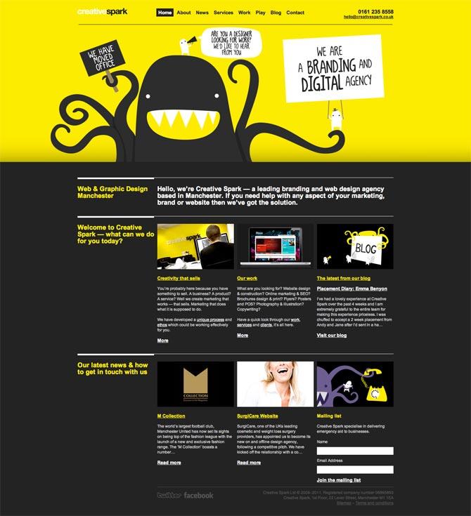

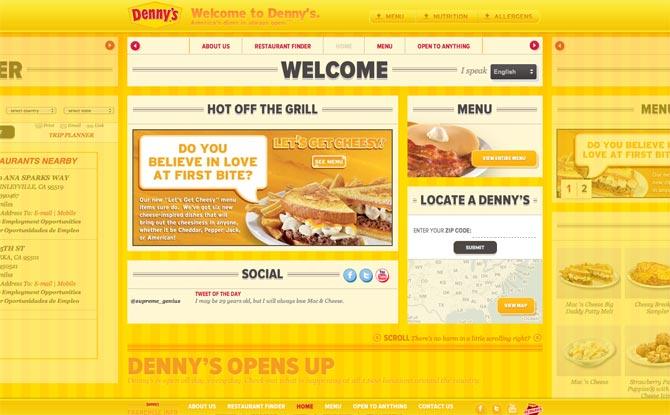
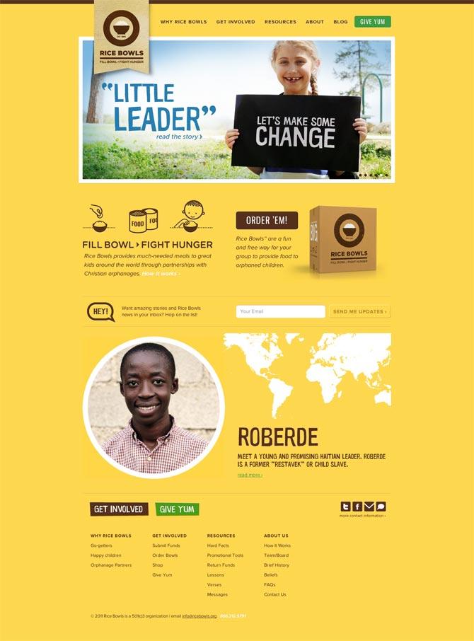


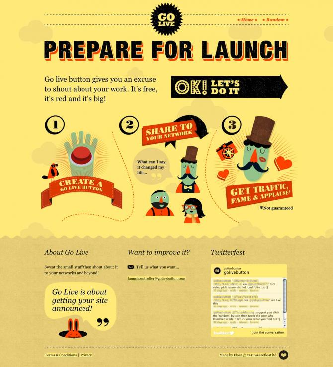
Yellow can be good for creating high impact websites but also lighter shades can be nice for light and airy designs. Far from bring a common
