Clean and Unique Website Layouts
Category: Web Design - Published: Mar 25, 2012 - Tags: interface design
Minimalist web design has had it's impact on web design and now we've gone on, bring back the color and imagery while still keeping the clean look. Some new layouts have also become more popular in the last year or so. Here are some fresh designs that are clean and interesting.
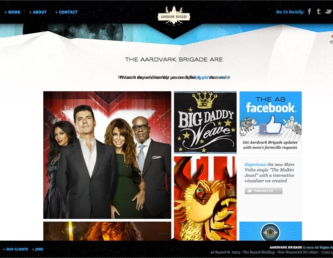
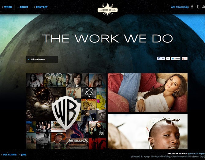
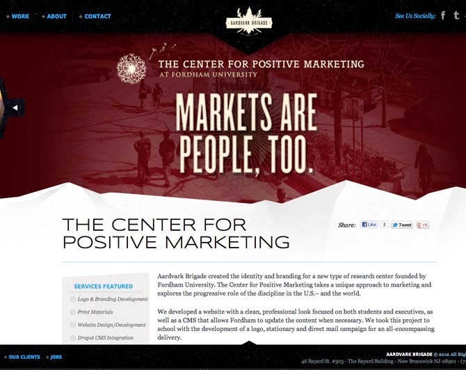
Aardvark
An interesting design. The odd angles make for a lot of added interest that might not have been there otherwise. The best part of this website being the work pages. They added a lot of detail to their work pages and the background header images is a nice touch.
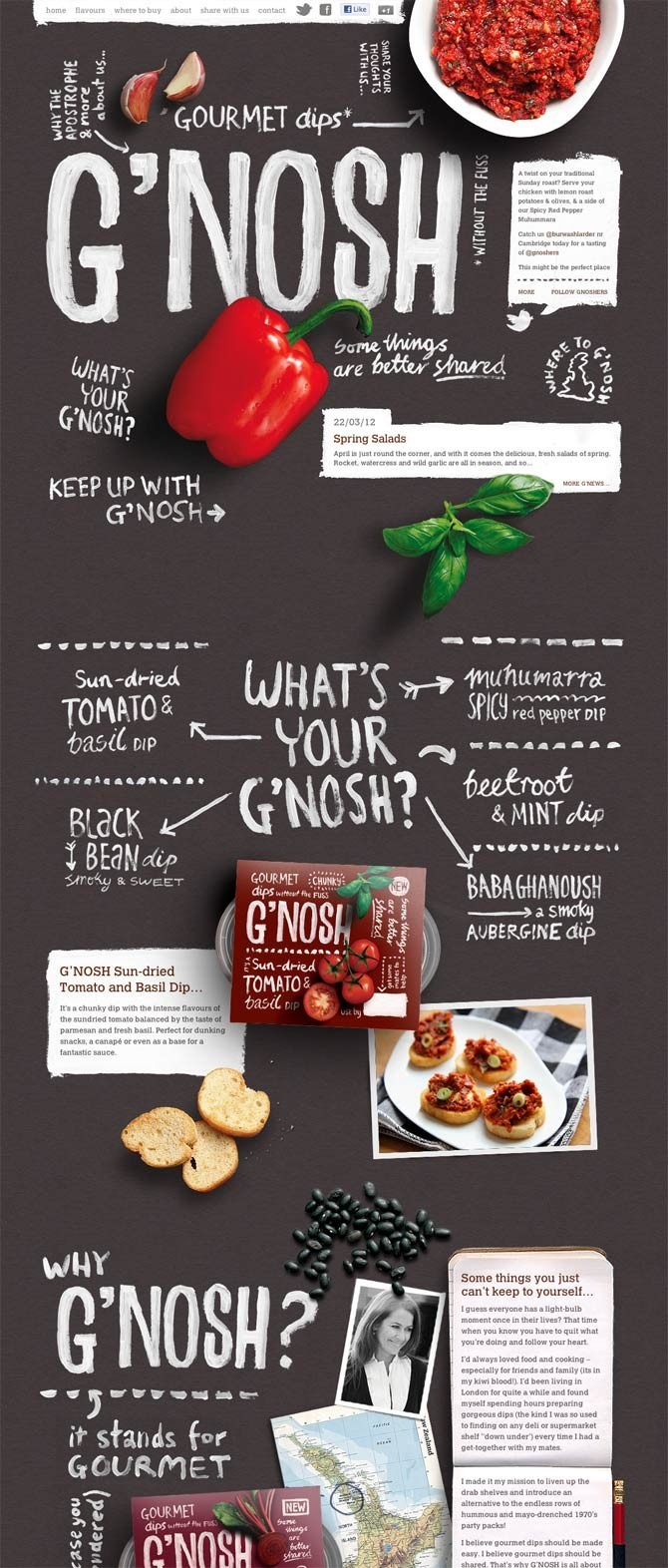
G’nosh
A great use of typography and imagery. I’ve only seen one other website using actual paint for the type. Eats of a lot of file size but for websites that don’t need to load extremely fast, it can really stand out.
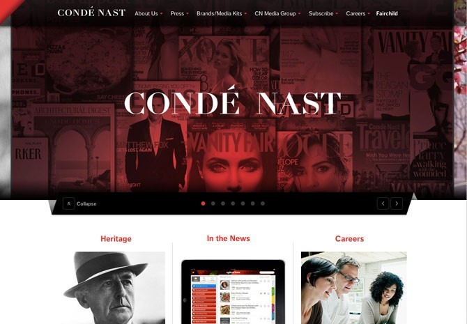
Conde Nast
Clean design with large image slideshow background. Not totally original but a nice design.
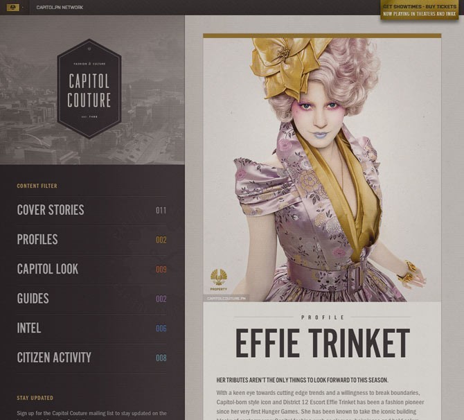
Capitol Couture
The site has a actually changed since last I saw it but the colors and layout are stil very nice.
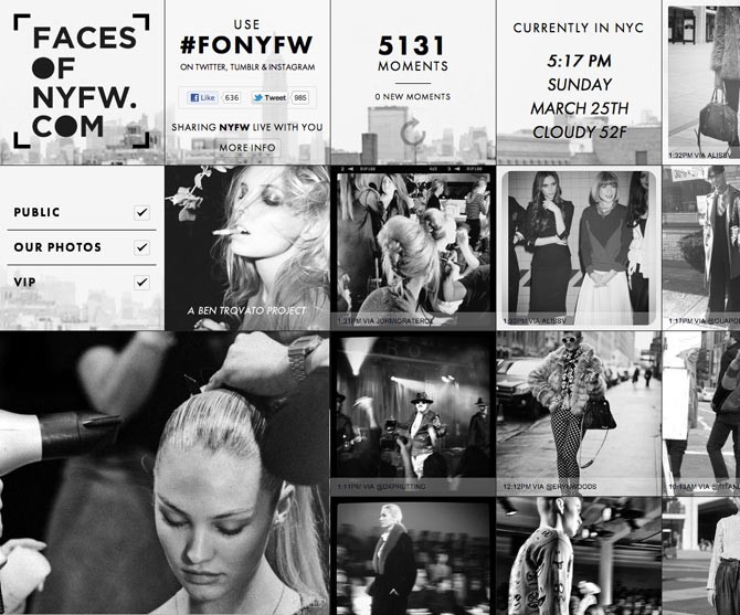
Faces of New York Fashion Week
An interesting black and white, primarily photo blog.
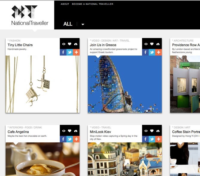
National Traveller
Another clean photo blog layout.
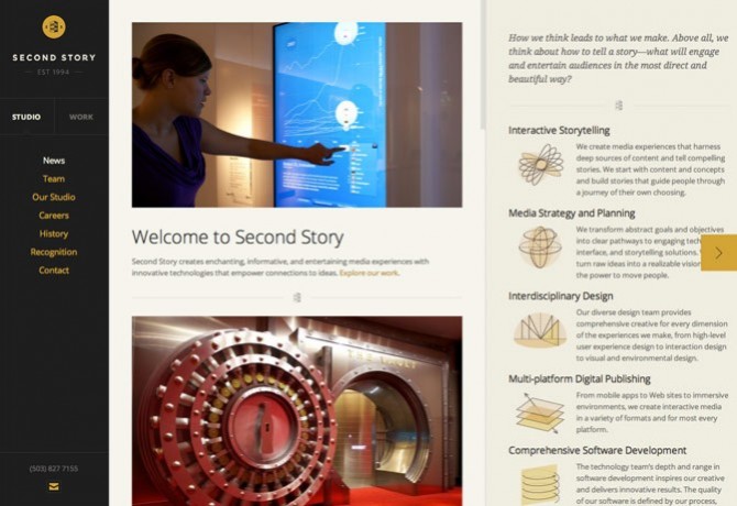
Second Story
This site has a real nice color palette, similar to Capitol Couture. The interesting part of the design is the site scrolls a little bit horizontally and each section slides horizontally, essentially several pages set next to each other. Not something I can see really catching on but an interesting idea.
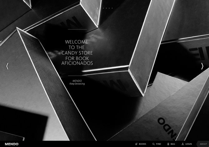
Mendo
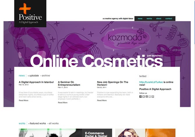
Positive
Another clean layout with bright imagery in the background slider.
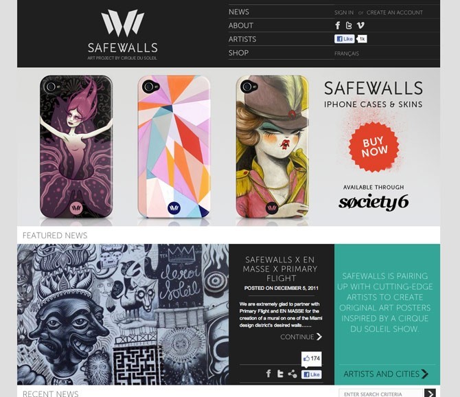
Safewall
A pretty clean layout relying heavily on the nice artwork.
