Options vs Simplicity
Category: Advertising Promotion - Published: Dec 09, 2011 - Tags: blogging
On Twitter today I noticed a tweet by @tkenny (Tom Kenny), the guy behind Inspect Element. He is redesigning his blog and tweeted these about the use of sidebars, which I didn't agree with but wanted to share:
“Starting to think sidebars are useless. If you’re half way into reading an article, do you really need the distractions they introduce?”
“What use are latest post or most popular posts when you’re reading? Presumably you’re reading it because you want to, not to get distracted.”
“One of the reasons why services such as @instapaper are so useful. They get rid of all distractions as well as improve legibility.”
“I don’t have any solutions to removing sidebars as they’re useful for ads but it’s all part of my thinking to simplify as much as possible.”
He makes some valid points about readability and focusing everything on the blog posts. Reducing distraction can be good but assuming your readers prefer it this way is a big assumption.
Which brings me to one of my favorite quotes, from Under Siege 2 (I didn’t actually know the movie, had to look it up).
Assumption is the mother of all fuckups.
Not that his blog design is going to have problems, I’m sure it will be great. But is was the assumption I had a problem with. How do you know your readers want simplicity?
Personally, I like going to blogs and browsing around, kicking the tires. I often click on the Most Popular post lists, check out different categories, and even crazy as it seems, click on ads if they look interesting. I also, don’t read complete posts. The majority of the time, I read the headings first, and if it looks like something good, I might go in a little deeper, especially, if I am on a blog I’m not familiar with. Anyone can write a catchy title or Google can serve up the wrong post, so I’m pretty quick to see what is there, and get out if I don’t find what I’m looking for.
At the same time, if the post might not be worth reading but I feel the blog could be, I often click around the site a bit. And the sidebar is the perfect place to put links for browsers like me.
At the same time I can see where @tkenny is coming from. There are tons of blogs with absolutely horrible sidebars. Filled with ads, huge blogrolls/paid text ads. And if you visit enough of these sites I suppose you might just start ignoring sidebars completely.
I feel I have a legitimate argument, and @tkenny does as well. People read blogs in two very different ways. I still don’t like the assumption that readers would prefer simplicity over a useful sidebar, but I’ll move on.
Two Types of Blog Readers
There are two types of blog readers. Those that focus on the posts and read it like a newspaper, and those who scan and skim, looking for different bits and pieces. If you are looking for active engaded readers you want the first group, if you want people to click on ads, you probably want the second.
And the good thing is, you can target either group by the way you set up your blog.
Engaged Readers
Seems simple, but to get more engaged readers, you want to write posts in the style they prefer. Write longer paragraphs, a lot less heading, no images, nothing except good, quality content. These are heavy readers, so you need to either give a great option, have a great story to tell, or want to be teaching something useful.
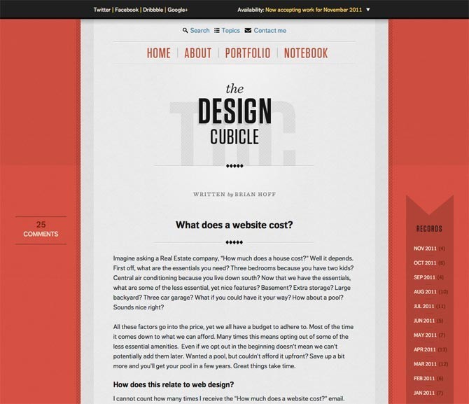
The Design Cubicle, has only one post on the homepage, and nothing indicating what other content is on the site. You have to click on random links and hope something useful can be found there. This blog is set up for regular engaged readers.
Browsers
Browsers could be looking for entertainment, killing time, searching for something, or just looking for something new. I have a pretty long list of blogs bookmarked and I randomly visit some of them every couple of months or so, to see if there are any gem posts. And you might say, why don’t you just use an RSS reader and check them all? Personally, I just don’t like reading rss. I enjoy the experience of visiting the blog and discovering on my own.
But enough about me. To target these kinds of people, write shorter posts. Everything needs to be easily digestible. Lots of photos, links, and short paragraphs. These are the Roundup lovers, and the kinds of people you draw from StumbleUpon. Give them tons of links to click on. Organize your best posts into groups and categories. If you wrote a lot about one topic, create a cornerstone posts about it so these kinds of readers can check out all of your work.
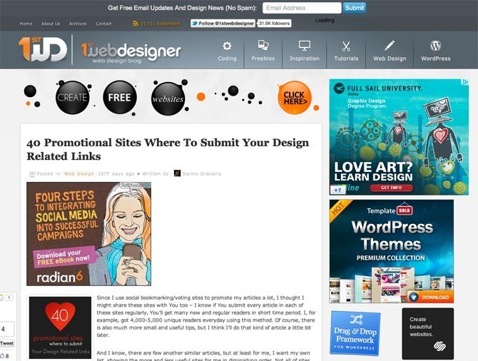
1stWebDesigner does have some content for engaged readers but for the most part is set up for browsers. The site is loaded down with ads, photos and links to different content. Plenty to see and do.
The Moral of the Story
There is no right or wrong way to design a blog or the kinds of content to create. You have two types of readers to choose from, and there is no reason why you cannot target both. I like browsing but when I do find long, interesting posts, I dig in and read. If you want to make money on pay-per-click ads you know which type you want, and if you are looking to turn readers into clients, you have your type as well.
Everyone likes both types to an extent. Which type are you?


