Using Contrast Effectively in Web Design
Category: Web Design - Published: Dec 22, 2011 - Tags: interface design color contrast
Every website has a purpose. Depending on the type of website you have and your goals, your design needs to provoke your audience to act in some way. Buy a product, sign a petition, read an article, share with friends, and so on. One way of doing this is with contrast. The colors we use, the amount and types of content you display, can have a big impact on what our viewers see and do. When you have a very specific direction you want to steer your viewers in, the more contract in the right areas, the better.
Contrast is great for inciting action because, by it’s very definition, contrast is different. Our brains excel at making comparisons. So when you see five navigation buttons and four are blue and the fifth is light-blue, our brains register that difference immediately. No thinking involved. We use comparisons every day to gage the things that we like and dislike, the people we are attracted to, the foods we eat and every other aspect of our lives.
Using this idea, we can set apart important elements of our websites to draw the eye of site viewers. And it doesn’t need to be “in your face” or obtrusive. Even subtle areas of contrast can direct your viewers to, if not commit to an action, at least be aware of the content you have highlighted for them.
Typography
We use contrast in web typography constantly and you don’t even think about it. Headings are used to define blocks of text and they use either font size, color or white space to create contrast against the paragraphs. Bigger text is typically used for titles while smaller text is the body copy. These basic principals can be found throughout every web design.
While most uses are commonplace, here are a few examples that I thought were particularly well done.
Simplicity
The more important the message, the less you want to put around it. Less, colors, less photos, less graphics, less text. The only thing you want to add more of is whitespace. Simplicity does not create contrast but it allows for contrast to stand out even further, by highlighting important elements of the design.
Size
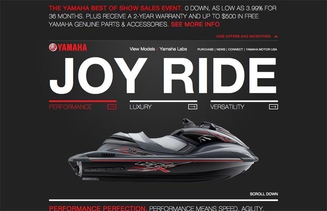
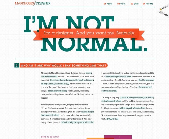
The size of important elements in relations to the rest of the page can set them apart nicely. This can be done with large typography, graphical elements or call to action buttons.
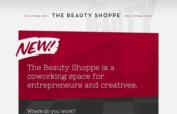
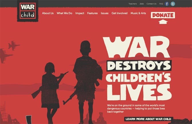
Color
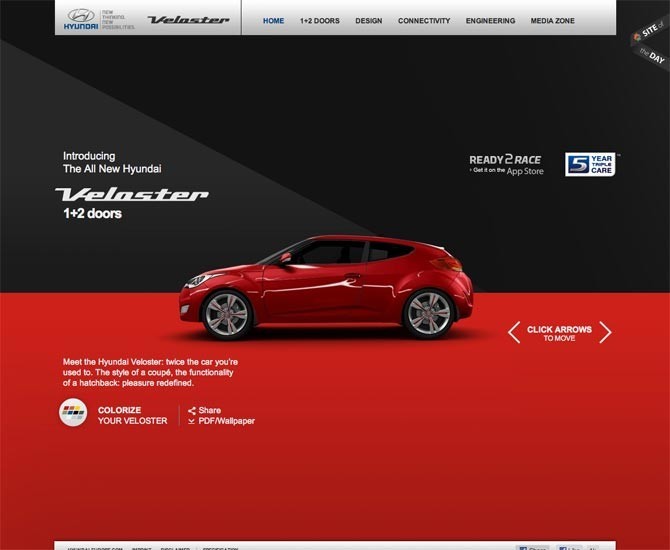
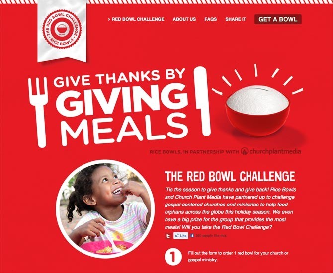
Color is an easy way to create contrast. Either by pairing a light color with a dark or using two complementary colors to create interest.
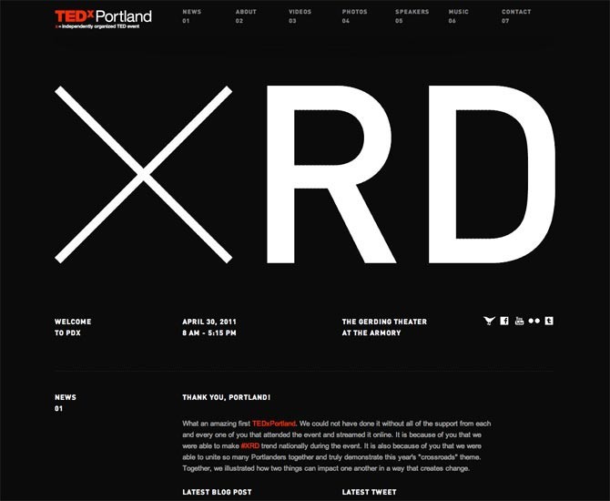
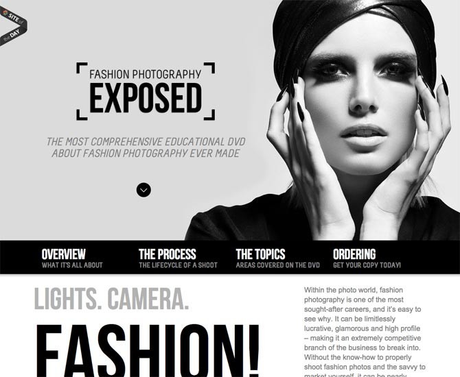
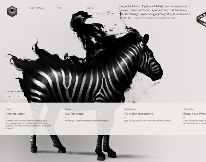
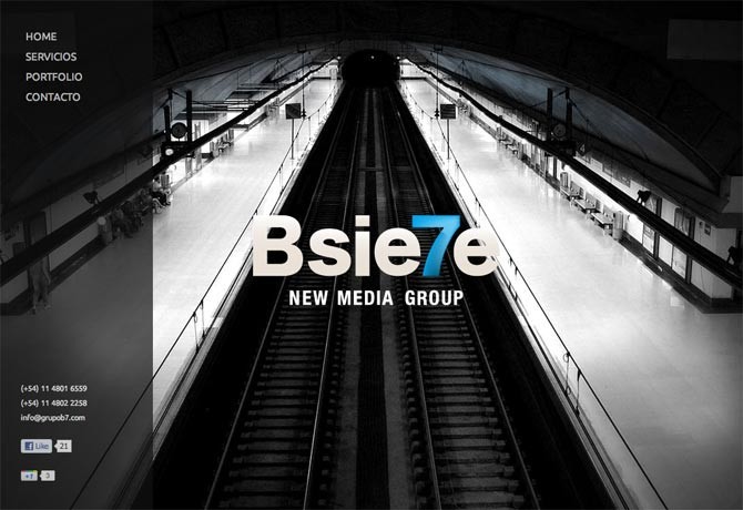
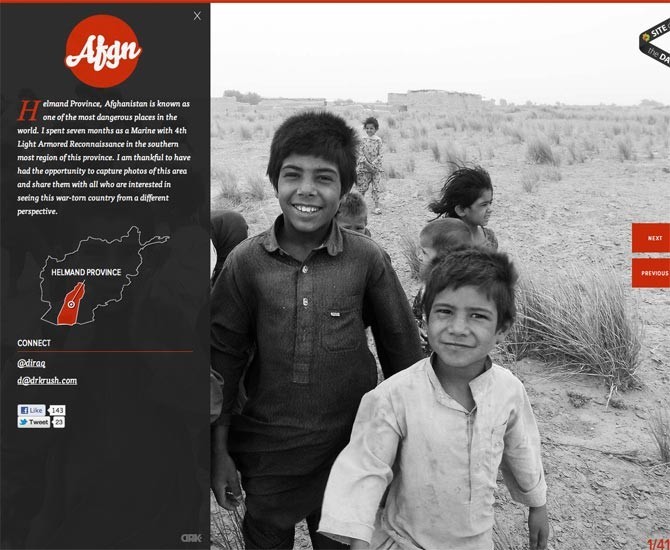
Black and White
Black, the absence of color and white, complete saturation of color, are as far apart as you can get from each other. So they can be highly effective in creating contract between elements or for setting type off of it’s background.
Using just black and white is a great way to set a dramatic tone with your audience.
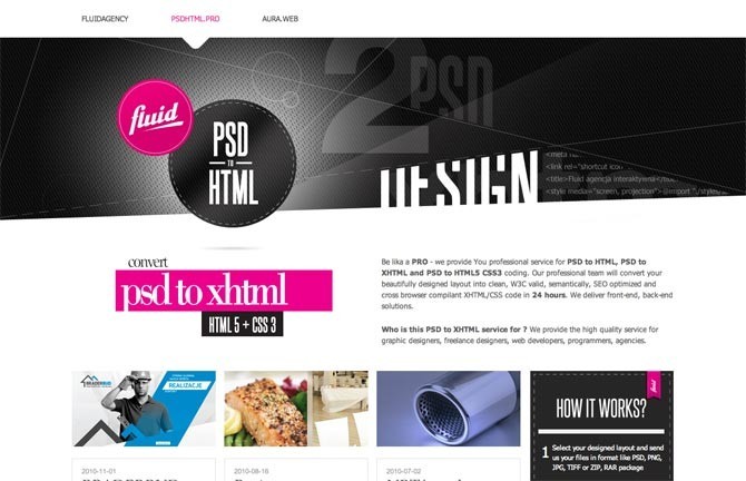
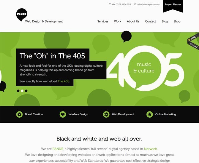
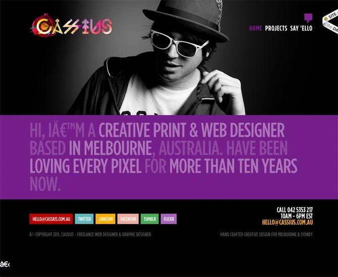
Black and White + One Hot Color
To really make a design pop, add a hot color to your black and white design wherever you need emphasis. A popular method in print because 3 color is a lot cheaper than full color but it works just as well on the web.
White Space
What you don’t show is just as important as what you do. The more focus you want to place on a given element, the less you want to place around it. A complex element needs to sit on a simple background. A simple element can stand out on a patterned or highly detailed background, although simple works here too. By eliminating all other design elements you force the viewer to see your message. You just have to make sure that message is worth seeing.
When To Use It
Contrast is often the easiest thing to create, and yet as designers we forget to use it in the most important places. We sometimes fall in love with making a design look good but lose sight of the purpose of the website we are building. Every time you introduce a new font or color or design element, think about how it effects the purpose of the design. Use these new elements only to draw the view’s eye around the page. We get in habits of making all links be a certain color or all headings being the same but not all elements are equal because there is only so much a view can or wants to take in. Prioritize and eliminate anything unnecessary.
Don’t add new elements to a design because it looks empty or you need to obtain symmetry. Instead, remove everything that is not vital to the message. If the client only gave you so much information, don’t fight to fill the page. Highlight and make work what you have.
Deemphasize elements of secondary importance by giving them a smaller text size or a slightly lighter color. You can also desaturate, blur or add highlights to background images. This is one of the steps few designers take when finishing up a design. Step way back and see what pops out at you about the design from a distance. If it isn’t your primary message, you did something wrong.