Photoshop to CSS, Shadow in Web Design
Category: Web Design - Published: Feb 26, 2012 - Tags: interface design
When it comes to good design, it can be the most basic elements that make it happen. Shadow and gradiation of colors can be used to both create perspective and depth, as well as contrast in web design. For a while now we’ve only been able to create these in Photoshop but now we have some tools available in CSS as well.
Perspective and Light Sources on a 2D Screen
Websites live on a backlit 2d screen. Everything else in the real world doesn’t. So really, so much of what we do as web and interface designers, is simply mimicking reality. Creating shadows and gradiation of color to simulate natural light. Using little color tricks to make an element appear to have some depth or make buttons look “pressable” or at least different enough so users can understand they are ment to be clicked or pressed.
At some point, when most of humanity has lived most of their lives in front of a screen, things may change, but for now, much of what we design resembles what we are used to seeing out in the real world. The way that we use one pixel dark borders around buttons to show that they are clickable or to put a drop shadow below the top navigation to show it is the top most element on the page and therefor of high importance. Many of these are incredibly subtle. A user wouldn’t even notice most of the time but their eyes pick it up and register the differences instantly.
Both gradients and shadows can be effective ways of creating interest and depth. So I’m going to go over the best techniques in Photoshop and their css equivalent when possible.
Photoshop Gradient Methods
There are a couple methods of creating gradients in Photoshop. The worst is located under the Paint Bucket Tool (keyboard shortcut: G). I don’t like it because it isn’t precise and isn’t easily adjustable once you use it. Instead I just create a shape like a Rectangle or Circle (keyboard shortcut: U) to whatever size I need and then apply a Gradient Layer Style.
If you don’t know the button for Layer Styles is at the bottom of the Layers Pallet, on the left which says “fx”. Click it and select Gradient Overlay. The one thing to always remember about Layer Styles is that whatever the default is, should never be used, it looks like shit. The default gradient is a linear black to white gradient which really should never be used for anything other than a mask.
With linear gradients, less is more. See the photo for some examples.
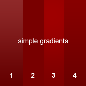
#4 Is a technique some people use and I do occasionally but it has some problems. Basically, all you do is reduce the opacity of the black and white gradient to around 5%, so the top is a little lighter and the bottom a little darker. The problem is, you can see it gets a little white on top. I prefer #4, in which instead of using a black and white gradient, fill your two gradient stoppers with the fill color, in this case red. Then slightly adjust both colors, shifting the bottom to a slightly darker red and the top a slightly lighter one. This way you stay in the same range of colors and you don’t get that washed out white on top. If you want a hotter color on top, move a little more toward an orange.
In case you were wondering, #2 is the solid red color and #3 uses the other technique I use a lot, the Brush Tool (keyboard shortcut: B). If you look at the light bouncing off the walls in your room, you’ll notice it isn’t a perfect gradation of color, there are spots and waves of dark and light. Using a Brush allows for more organic looking gradients. In case you were wondering, I never use Radial Gradients, they look totally unnatural, and it is so much simpler to select a very large, soft brush and paint in the light and dark areas instead.
When choosing a Brush, make it as soft as possible and turn the opacity down low. Again always trying to be subtle with gradients. You can always Brush on more color or if it looks like to much, reduce the opacity of that layer. You can also set the Eraser Tool to the same brush size and remove color if you wish. Another useful tip is to use the Marquee Tool to select an area, if you only want the gradient in a certain spot with a hard edge.
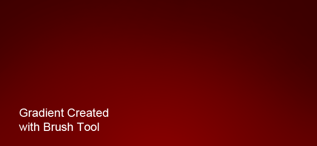
In the example about I filled the layer with a red color, selected a darker red and painted around the edges. Then I selected a lighter red and put one little splotch in the center at the bottom. It may take a few attempts but it gets super easy after doing it a few times. You can see the gradient isn’t perfect, the right side is a little darker, but that is what makes it realistic. And of course you can get more detailed adding highlights and shadows around the various elements on a page.
The biggest drawback to this technique is file size. Linear gradients can be saved as one pixel wide (or tall) images but when using a brush you have to save the entire gradient as an image. Also, these gradients are not easily editable. You may have to recreate them if the layout changes dramatically.
CSS Gradients
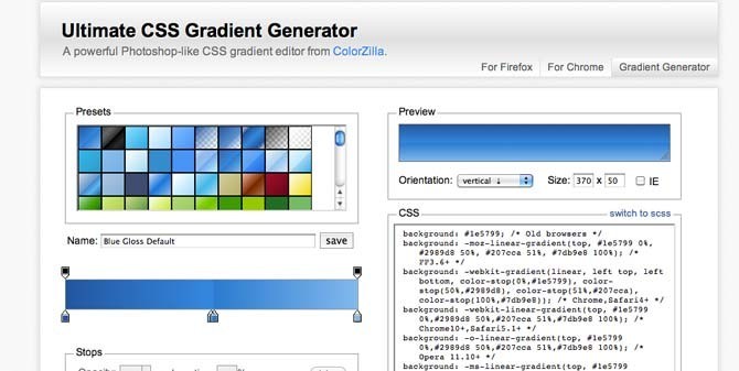
I could explain how to create gradients in css but why not just show an easier way. CSS gradients are a pain in the ass because you have to use a bunch of prefixes to get them to work in the various browsers. So instead of writing all the css I’ve found it easier to just use this tool. Just add the stopper colors where you want them, and copy the css into your style sheet. It is the Ultimate CSS Gradient Generator.
CSS gradients are not supported in all browsers but if you set a fallback background color the design should still be functional.
Photoshop Shadows
Just like there are a number of ways of creating gradients, there are even more ways of creating shadow and the methods above still work.
Like I mentioned above, the default Layer Styles should never be used. That applies to Drop Shadow and Inner Shadow as well. The default is a pure black shadow which is way too dark. Not to mention shadows should be the color of the background they are on. So if you have a shadow on a blue background, make the shadow a darker color of blue not black. When using Drop or Inner Shadow always turn off the check box for ‘Use Global Light’. There will never really be an instance where shadows will always be coming from the same direction.
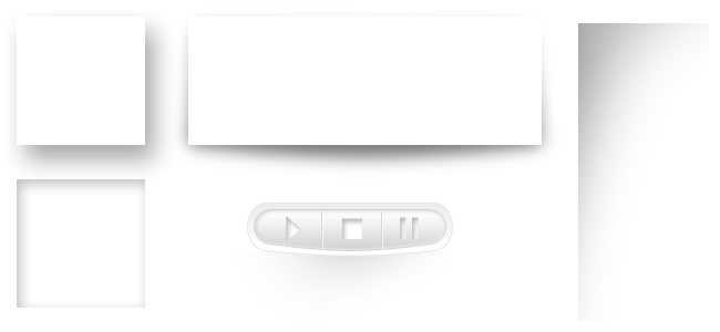
The top left example above is a Layer Style Drop Shadow and the bottom left is a Layer Style Inner Shadow. The top center one uses a little different technique. I create a shade layer, then duplicate it. Take one of the Shape layers and make it your shadow color. Then Direct Select (keyboard shortcut A) it so the points are visible. With the Pen Tool (keyboard shortcut P), add a point where the curve of the shadow will go and pull that point outward with the Direct Select Tool. In the example above I also moved the top left and right points inward. Then just use a Gaussian Blur (Filters > Blur > Gaussian Blur) to give it a faded edge. Note that when you apply Gaussian Blur it will rasterize the shape layer so you might want to duplicate it first and turn off that duplicate if you think you may need to change it later. Not move that blurred layer below the white shape layer.
The shadow on the right was just a Rectangular Marquee and the brush tool, same as creating the gradient above. And that final example in the middle is kind of a lame example, using all of the techniques together.
CSS Shadows
Horray for css because drop and inner shadows can both be created. In css it is known as box-shadow.
box-shadow: 10px 10px 10px #000;
Which produces an ugly black drop shadow. The first number is how far offset the shadow will be horizontally, the second number is the vertical offset and the third number is the amount of blur applied to the shadow. The first two numbers can be negative to create an inner shadow. And of course it would be too easy if this just worked. You have to use prefixes to get it to work in most browsers. But this is really just a design element and won’t break your layout if the shadow isn’t rendered correctly. So I say, go nuts and use this where you like.
And a bonus, here is a cool use of box-shadow.
Text Shadow
Text-shadow is created exactly the same way as box-shadow except there are no negative numbers allowed. I also saw over at CSS Tricks, that you can create multiple text shadows on an element. Text shadow has so many uses in web design, all of which have the role of increasing contrast between the background and your text. You really can’t go wrong with text-shadow on headings but it shouldn’t be necessary on body copy. Just remember less is more. A one pixel shadow is really all you need to set your heading off.
text-shadow: 1px 1px 1px #000;
Examples From Around the Web
Eye Scream Design uses text shadow on the tagline and also uses a white text shadow inside the gold medal. You don’t always have to go dark with text, sometimes a light or white text shadow can be effective at increasing contrast.

Shadows do not have to have blur. This example from Lets Do This uses solid drops shadows throughout the logo and sidebar. It works well this the cartoony feel. The logo bugs me a lot but the rest I like.

Quazar Web Design uses lots and lots of shadows and highlights on there homepage.

Further Reading and Inspiration
In the next post in this series I’ll go over the other side of the coin, highlights in web design. So that you can effectively combine the two to really improve the quality of your web designs.