Successful Websites with Horrendous Designs
Category: Web Design - Published: Dec 02, 2011 - Tags: interface design
If you don't believe content is king, than you haven't been around the internet much. There are tons of websites that are very popular with designs that make you want to tear your eyes out. As a web designer it can be hard to swallow, but the fact is that beautiful design comes in second to great content. Having a engaging design and a usable website are very important, but always remember what comes first.
Ugly can sell just as well as beauty can. As designer we often forget that fact. We strive to make our project usable and to put the content first, but deep down we want to make something to rock in our portfolios, to win awards with, or show off in the css galleries or Dribbble.
Starting With Popular Blogs
Blogs are especially notorious for having horrible branding and design elements. Bad Photoshop hack-jobs, web safe colors, crowded columns, you name it these blogs have it. It takes all of 5 minutes to throw a new Wordpress theme on, but for these very popular blogs they don’t seem to want to bother. And by popular, I mean very popular. These are all taken from the Technorati Top 100 Blogs list.
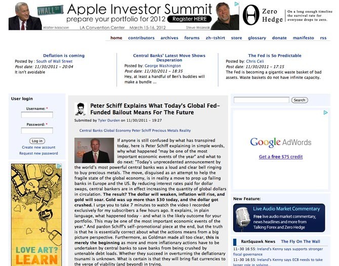
Zero Hedge
When you have a banner ad with Steve Wozniak’s ugly mug on it, and it improves the look of the site, you know you’re onto something special. Before there was responsive design there was liquid layouts, which happen to not be the greatest for readability. But with a sexy design like this, I’m going to allow it.
Big Government
Not the worst blog theme I’ve seen but definitely not the greatest. The sidebar is overcrowded while the posts have a weird white space issues on their right sides. The text is slightly too small and could use some more line-height. The heading banner sucks all kinds of ass with a pixelated american flag and the text with it’s white stroke where someone didn’t bother to add anti-aliasing.
But again as bad as the typography is, it is still legible. Conservative don’t seem to care about the branding of this site as long as they get to read some wacky, right-wing rants. (Sorry, no more political talk.)

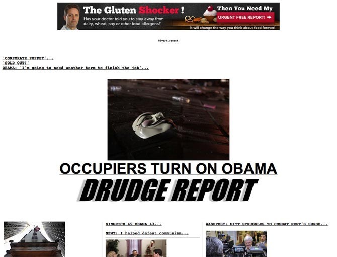
Drudge Report
A complete lack of any kind of design elements, and proper spacing. Half of the links, it isn’t clear what they go to, which I guess is part of the appeal of the site… Big ugly headings, small type, ugly everything. But that is the appeal of the site. News is news. Nothing is dressed up, although the titles can be pretty sensational, but that is the content, not the design.
An interesting read about the Dredge Report explaining why this truely is one of the best design on the internet at 37signals
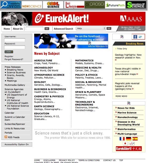
Eureka Alert
Narrow columns in a narrow, left aligned, layout. Everything is above the fold! Straight out of the year 2000.
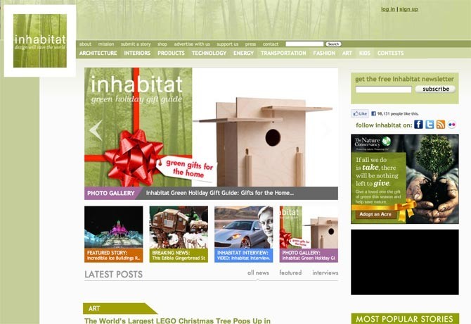
InHabitat
OK. I had to show this one because it is a website about design. Some really bad uses of white space. The ugly logo sits off on the left side of the screen and wastes a huge chunk of space and increases the minimum width of the design unnecessarily. Another equally odd amount of white space is located on the other side of the blog posts. It is like they converted this from an 800 pixel layout but decided not to change the post or sidebar column widths, just open everything up. I realize they are trying for nature colors but the baby puke green isn’t doing it justice.
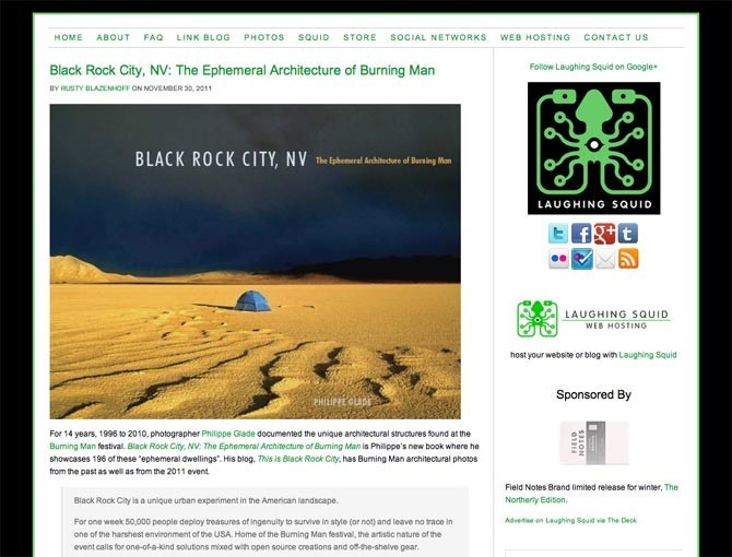
Laughing Squid
Can you get any less excited about a design than this one. But it may be intentionally boring because it causes the reader to focus on the content, which is primarily photos.
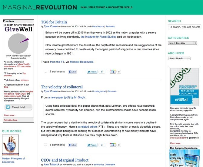
Marginal Revolution
Marginal says it all. Ugly, three column, liquid layout.
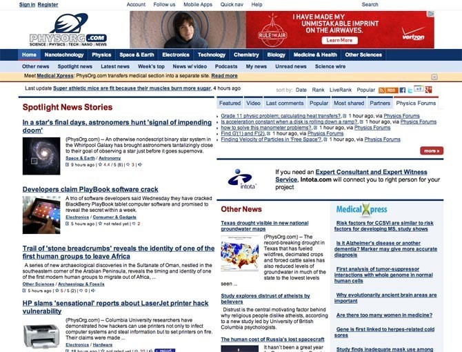
PhyOrg
OK. This one really is a mess. So overly crowded. But people who are interested in science have notoriously poor fashion and design sense, so to them I’m sure this design is simply lovely. (I have no evidence aside from the Revenge of the Nerds movies to back that claim up.)
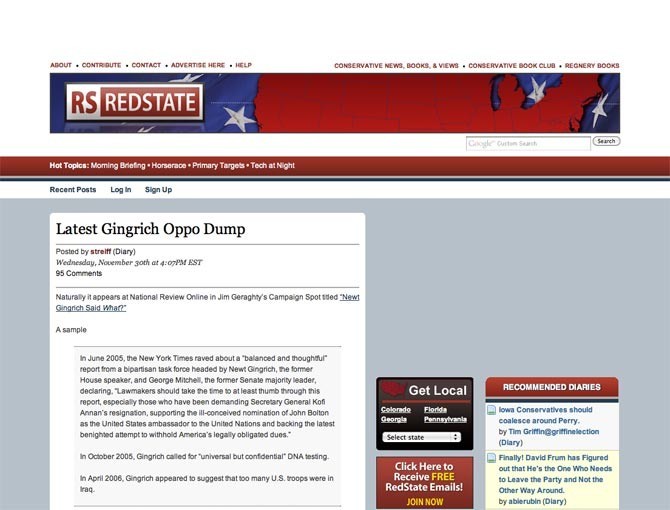
Redstate
Image is especially important in politics, but apparently not to political blogs.
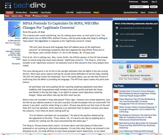
TechDirt
Tech blogs are known for having very modern and trendy designs. TechDirt’s design was trendy 8+ years ago. But the content is fresh, which is all that matters.
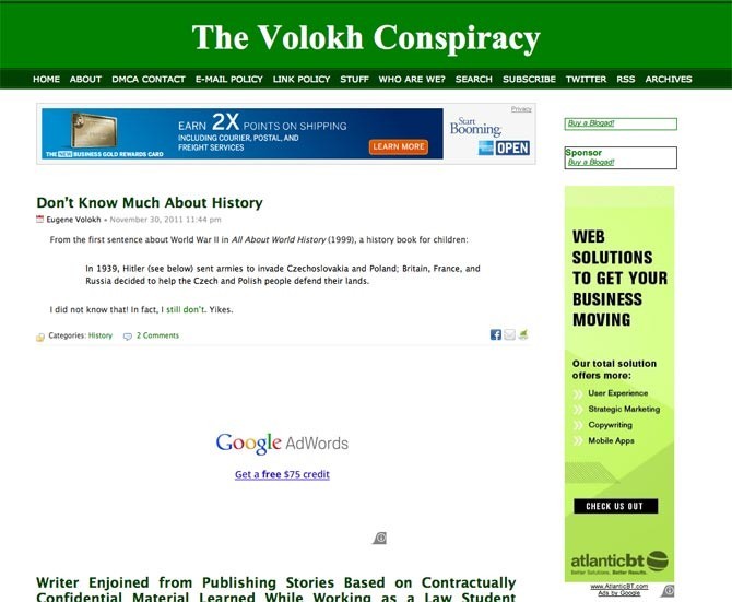
Volokh Conspiracy
I say every day should be Saint Patrick’s Day.
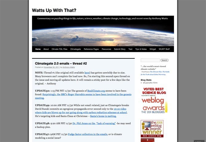
Watts Up With That
Tacky blog name, boring design.
Ugly Websites That Work
But there are some non-blog based websites that are even bigger and even uglier. Here are a few of them. Each of these sites do one or two thing extremely well. The designs are not good but the content is excellent.
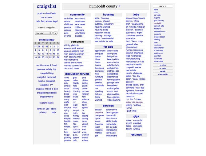
Craigslist
Otherwise know as the anti-design. Craigslist doesn’t even specify a font to use. The font stack reads “font-family: sans-serif;” for body copy and “font-family: serif;” for their wonderful logo. No images were harmed in the making of this website either. Completely image free. Colors are web safe. Internal pages are a liquid layout, the main content pages use a table based five column grid. Craigslist probably looks just as wonderful in IE5 as it does in the latest version of Chrome or Firefox.
As much as I hate the table based layout and the narrow width the site loads insanely fast and does an effective job of displaying classifieds for millions, maybe billions of people around the world.
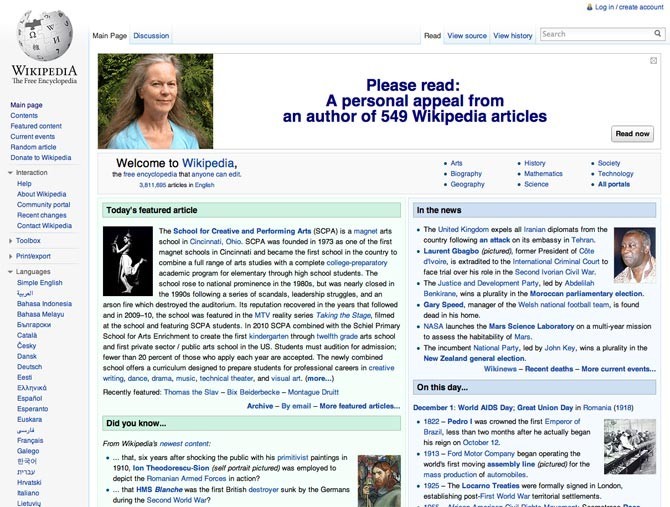
Wikipedia
Similar to Craigslist but you can tell they are trying at least a little bit to make the site not as painful on the eyes.
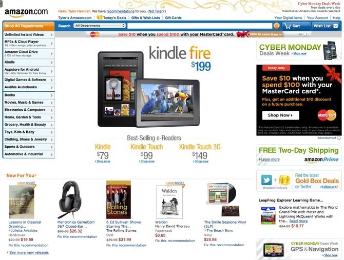
Amazon
The site is fairly well laid out but the ui elements are rather lacking. The navigation uses old web2.0 glossy buttons and what look like old web safe colors. The logo isn’t as bad as Googles, but it is pretty close. The design is partially responsive but it doesn’t work at small sized and looks really bad at larger widths. Products fill the page almost randomly. Some rows have nine products some only have three.
But what Amazon lacks in design it makes up for in selecting the perfect products to display to customers. Everything is custom to the user. Recommended products based off past purchases, products that were viewed before and suggestions of similar products the customer might like.
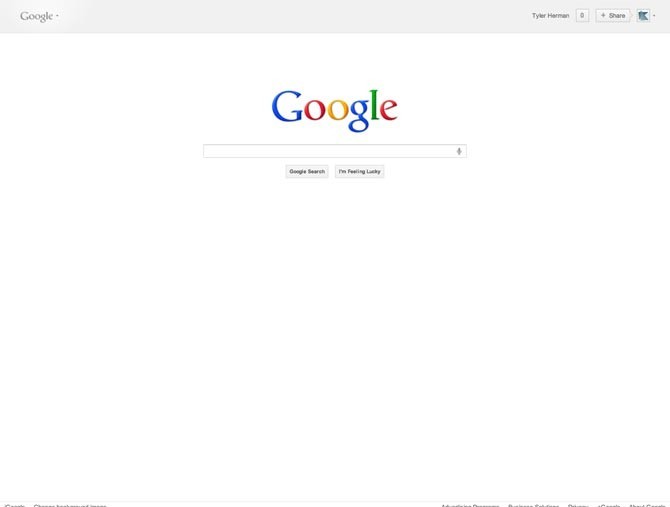
And how could I forget Google. One of the worst, large corporation logos out there. In fact it may be the worst logo of any company that large. If you know of another one, please leave a comment, I’d like to see it. The designers at Google were actually smart. Instead of trying to polish that turd, they decided to put cool birthday messages on the Google homepage. They knew they could never be an Apple, or even a Facebook (which should be on this list as well). Instead they went with interesting and fun. After all, they are in the business of helping people discover things. Well that and hocking ads.
The Moral of the Story
I hope you enjoyed looking at some of the finest design the internet has to offer. And hope you now see that design doesn’t have to be beautiful. It can be ugly, it can be obnoxious, so long as the content is stellar.
So if you are one of those people who redesigns your blog theme every three months, or just has to tweak every last pixel, over and over again. Take a look at some of these designs, and try to remember that it is your content that matter most.
There are dozens more that didn’t make the list. Leave a comment with a link to the ones you know of. I’d like to see them.