Awesome Conference and Festival Websites
Category: Web Design - Published: Feb 19, 2012 - Tags:
When it comes to awesome looking websites, conferences and festivals tend to be some of the best. They are ment to be fun or informative events so designers are able to have fun with the design. Often experimenting with new techniques, playing with wild colors, strange type, and crazy imagery.
What Makes These Event Websites Successful
There is a variety of design techniques in play here. I wouldn’t say any one works better than another. The two things each site tries to do:
1. Name dropping is important in event sites. People want to hear good speakers they know of at conferences and good musicians at festivals. Most of these sites show there best 3-4 right on the homepage. When customers have a number of options to choose from you want to show your biggest and best up front.
2. A lot of these sites either try to create an atmosphere, or show what it is like at the event. This can be done by showing the types of people who will be present, the typography and color and really, the amount of energy the design creates.
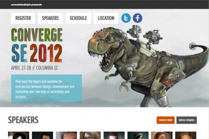
Converge SE
What do dinosaurs with mechanized parts have to do with the web industry? Nothing at all, they just happen to be awesome. Never underestimate the power of random imagery to gain attention. I really like the watercolor texture applied to the type. A really nice treatment.
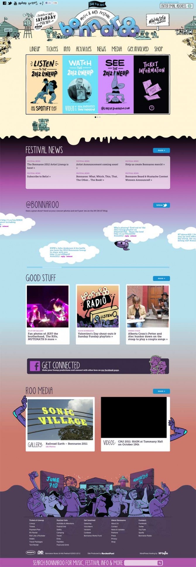
Bonnaroo
Another use of illustrations. Nothing to amazing talent wise but I like the color pallet. They chose not to be too crazy sticking with a lot of blues and purples.
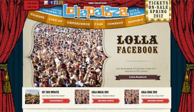
Lollapalooza
Worth taking a quick peak at the actual site. I don’t feel the large slideshow is the best use of the primary real estate on the homepage. But there are some nice touches here. I especially like the animated signs with flashing lights, very cool and attention grabbing. At some point I think animated gifs may find their way back to the web. There really is a lot you can do with them, people just don’t spend the time for whatever reason. It doesn’t have to be anything glaring either. Just a subtle change in color or positioning can bring a lot of interest to a page.
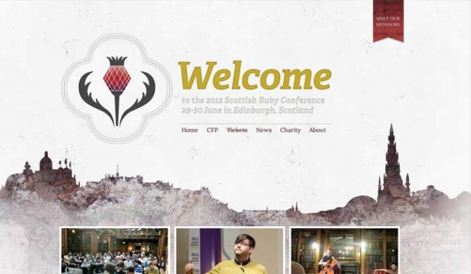
Scottish Ruby Conference
A little bit different approach. Softer, faded colors with a beautiful background. I don’t know if I love the ruby graphic or the lack of a title but I guess I’ll get over it.
Made In Spain
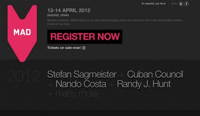
Super clean, nice, simple color pallete, almost the opposite of some of these other sites.
Made By Few
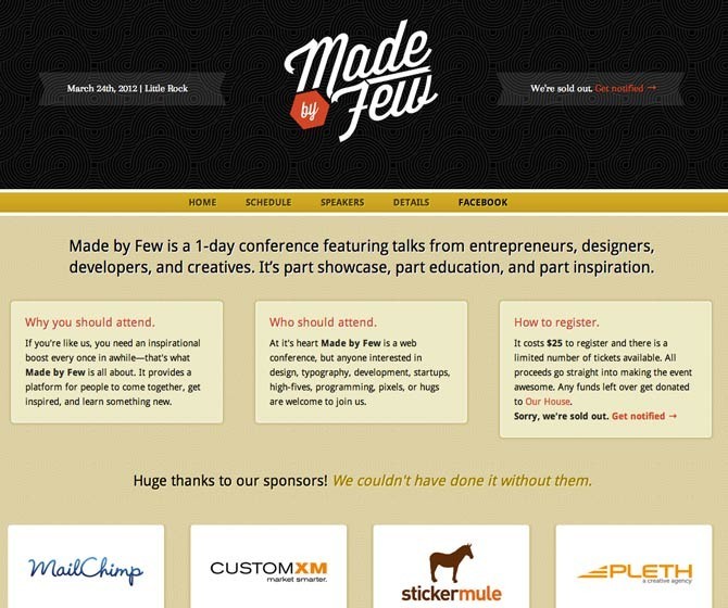
Not terribly exciting but a nice logo and use of a background pattern.
User Experience Lisbon
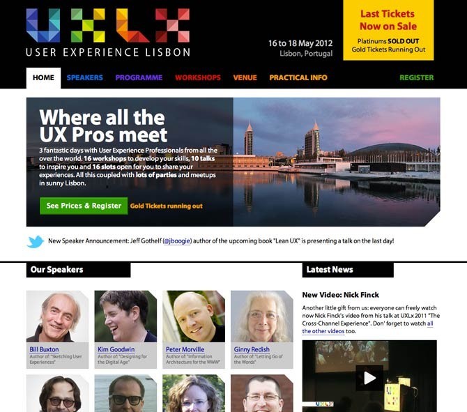
Another not super exciting layout but the logo is nice and the content is presented well.
Skive Festival
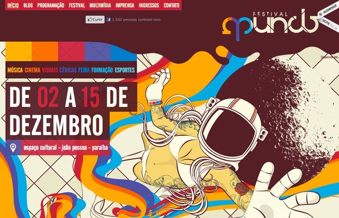
Festival Mundo
Another one that uses motion with the various background elements. I don’t know if I really care for the way the content is laid out but the design is interesting.
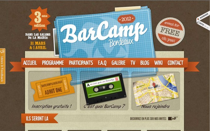
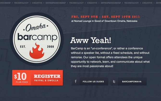
Barcamp
There are a lot of Barcamp websites that I looked at and these where the two I liked the best.
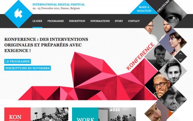
Kikk.be
A design that takes advantage of simple shapes and patterns.
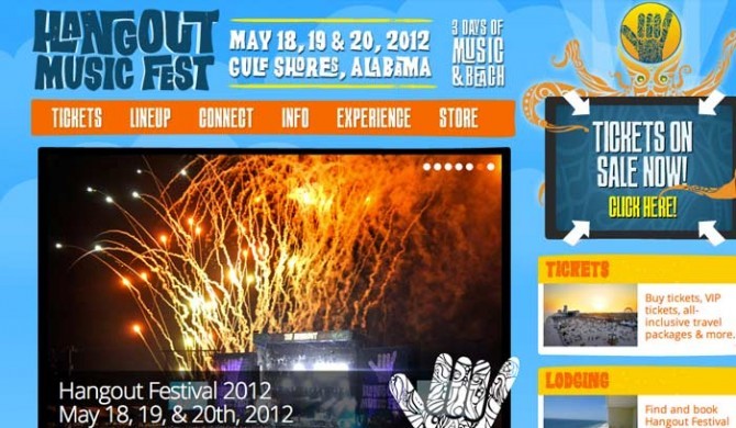
Hangout Music Festival
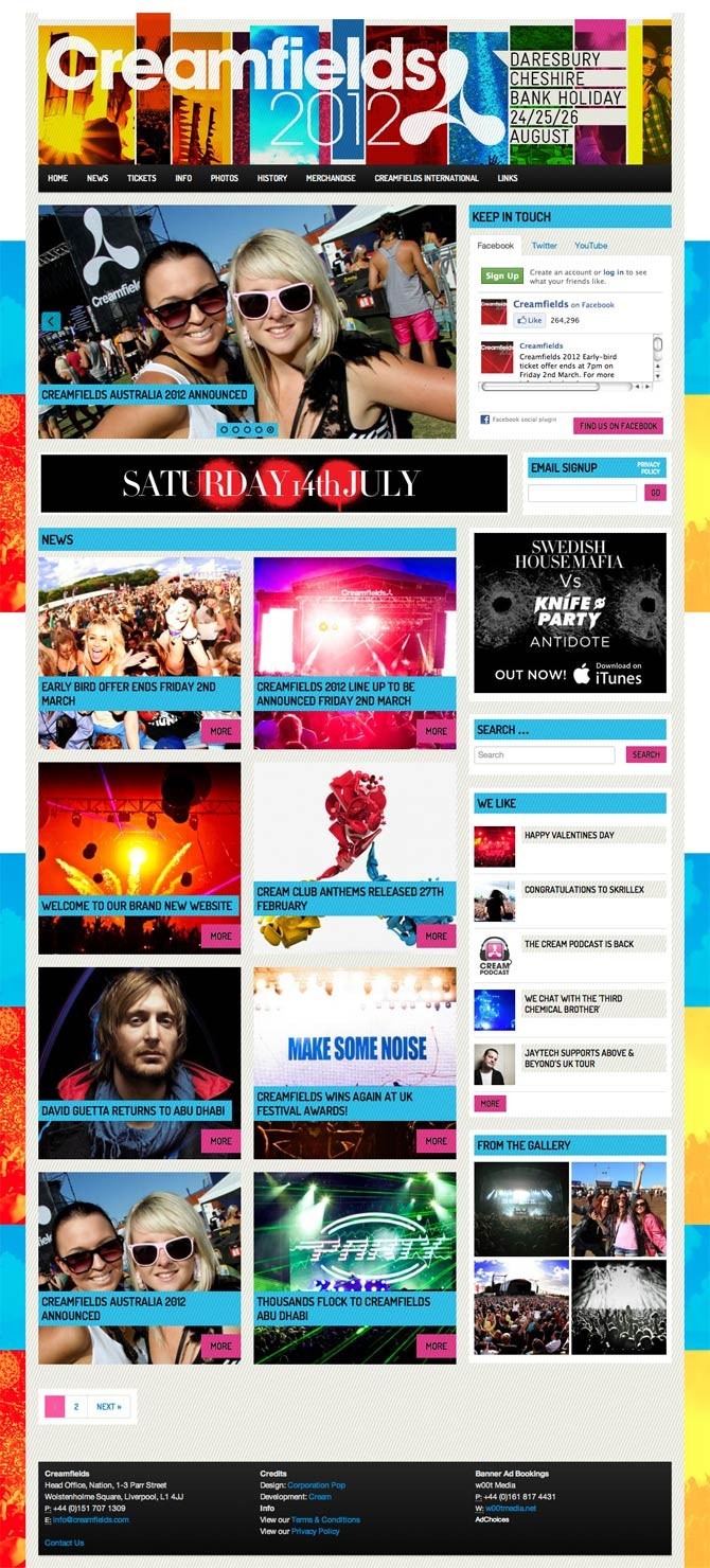
Creamfields
One of my favorite festival sites of the year. Bright fun colors. Festivals should be fun and this design says exactly that, fun.
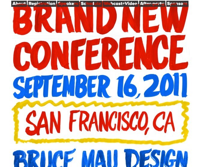
Brand New Conference
A pretty unique design, using an actual painted sign as the design, or at least it appears that way. If you saw a sign like this in a grocery store you wouldn’t look twice but on the web it really stands out. Repurposing styles and ideas from print are an easy way to add a little something extra to a website, you just have to be clever and think of something.
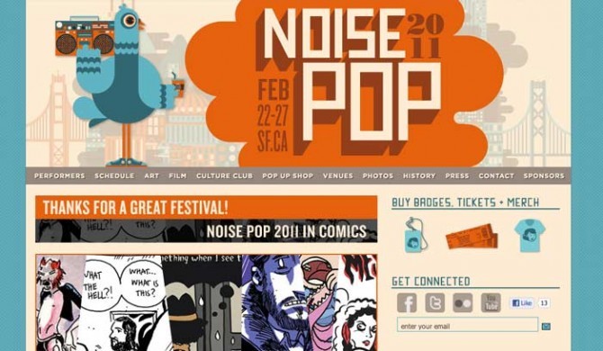
Noise Pop 2011
The layout is a little pedestrian but nice visuals.
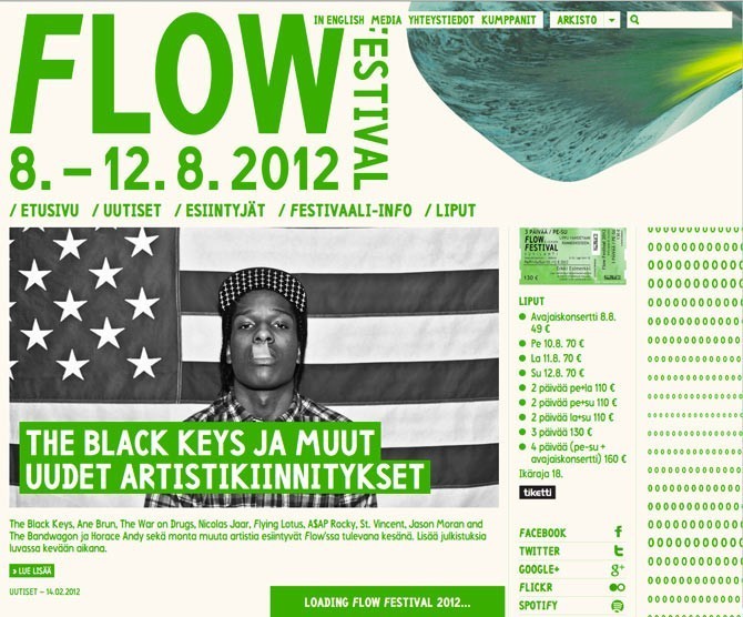
Flow Festival
This one seems to be in transition from 2011, still a really cool layout and design.
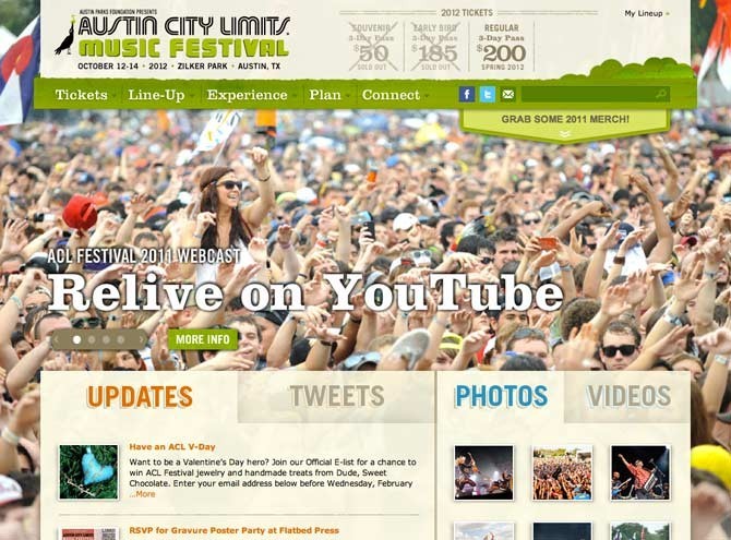
Austin City Limits
I don’t like large imagery for the sake of large imagery but this site uses it well to show the emotion, atmosphere and size of the event.
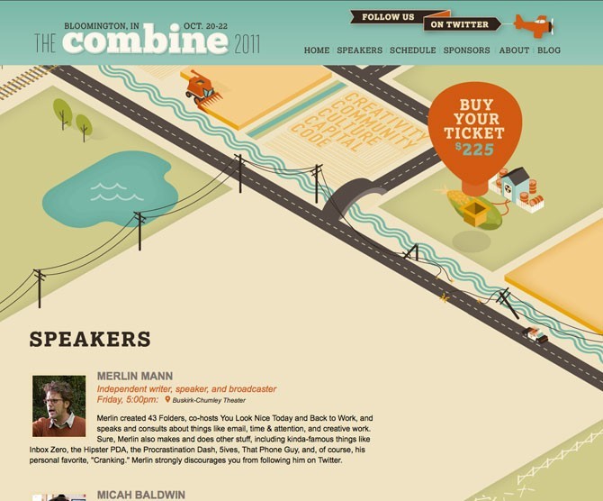
The Combine
One of the cooler designs from 2011.
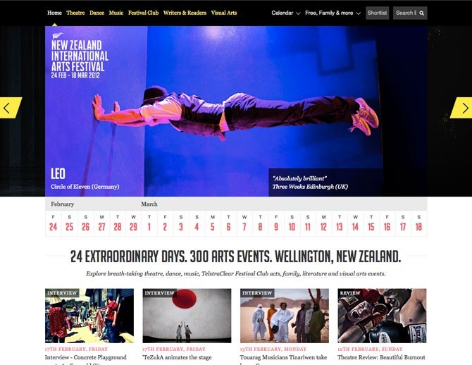
New Zealand Art Festival
Another website where the slider and photography is the primary design element.
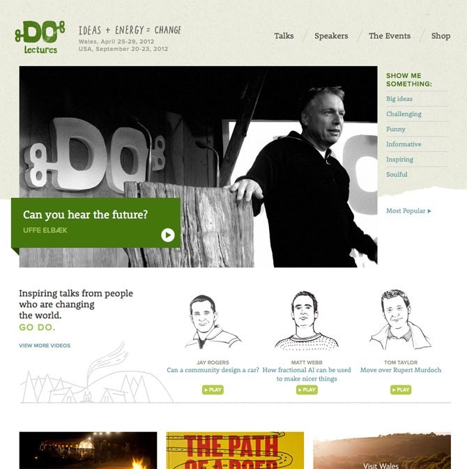
Do Lectures
A little bit different than some of the other brighter website I’ve shown here. A nice muted background with good color choices and hand-drawn typography. With a light background even green can become a high contrast color.
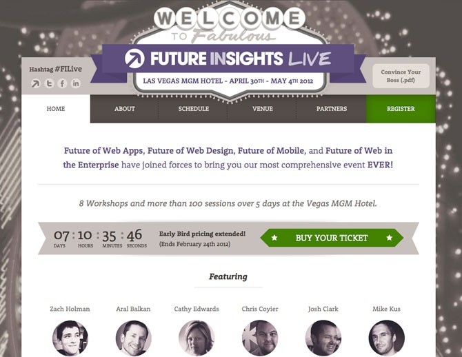
Future Insights Live
I really disagree with the color choice for this (or lack thereof) but it is worth showing.
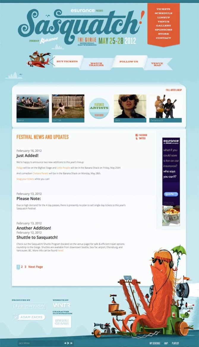
Sasquatch Music Festival
I love when a website has good illustrations or artwork and this one definitely has it. Last years website was also really great. This one feels a little open in the content area but I’m sure they will polish it up when it comes closer to the time of the event.
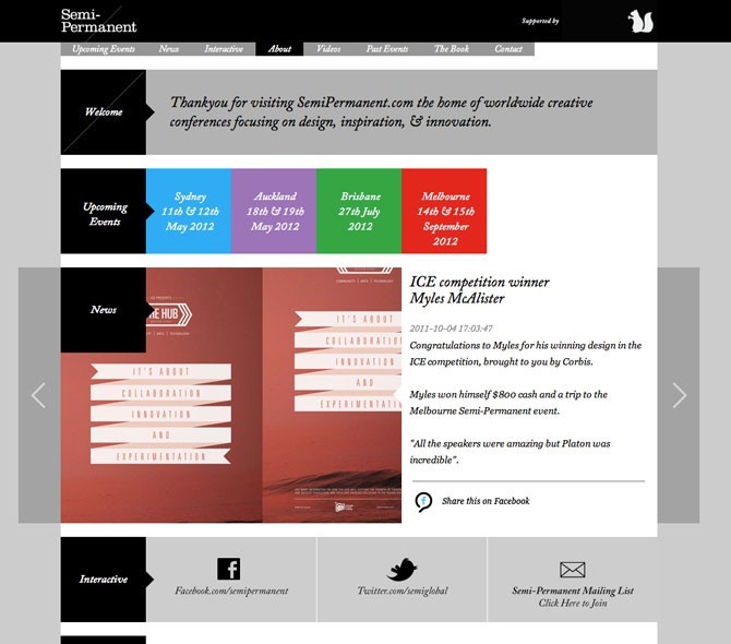
Semi-Permanent
This design is another that keeps with simple colors and boxes for the various elements. It uses video and other visuals well.
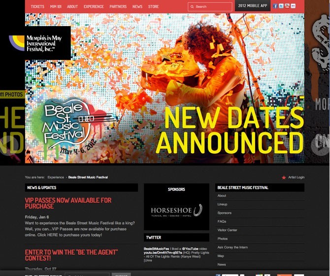
Memphis In May
This one is all about the photography.
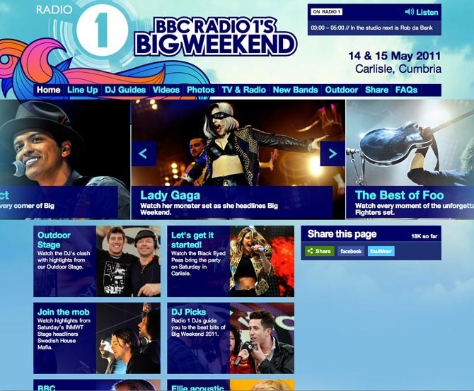
BBC Radio’s Big Weekend
Nice colors and logo.
From looking at this selection of designs, there isn’t really one method or style that works the best. Everything is viable as long as it is engaging and fits with the audience.
